📃 This article is part of a series on Identifying Electoral Fraud Using Trend Analysis.
We recommend reading the previous article The Battle of the Largest Counties to understand the background and context for this article.
The voter turnout rate – the percentage of people who voted – shot up dramatically in 2020, setting the highest rate in 120 years! How common is it to see such dramatic increases? Let’s look at the data.
There were 22 million more votes counted in the 2020 election than in 2016 — a 16% increase. This percentage increase overtook the 2004 turnout which held the previous record, when G.W. Bush won re-election. The Democrat turnout in 2020 was also much higher than the previous record set in 2008 for Obama’s first term.
The claim is that the increase in votes is consistent with the increase in the voting age population, and is completely normal.
But is it?
We found the “voting rates” for each state for every election from 2020 to 1976 on the census website. The data is contained in 2 separate Excel files, with 2020 results here, and the remaining data here.
💡 The “voting rate” is equal to the total number of votes cast divided by the total voting age population, and is expressed as a percentage.
Difference Analysis
So armed with our data covering 6 elections from 2000—2020, let’s look at which states also set a recent “voting rate” record.
We’ve added columns to help compare 2020 with 2016 (20-16), 2020 with 2012 (20-12), and so on. We just subtract the voting rates between two elections to get the difference.
We’ve then highlighted the states where all the differences are greater than 0, that is where the 2020 rate is greater than all previous election voting rates.
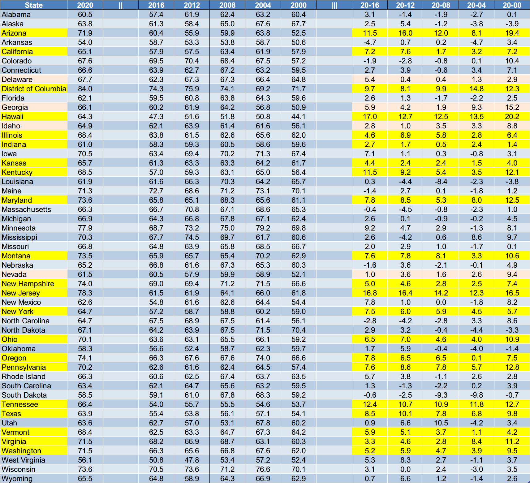
We can see that 25 states had their highest turnout rate since 2000! Look at Hawaii, New Jersey, Tennessee, and Arizona, all with many gains well over 10% (!).
(It’s interesting that Seth Keshel flagged 3 of these as showing significant anomalies in his estimates of election fraud. See what he wrote about Hawaii, New Jersey, Tennessee, and Arizona.)
What else can we learn from this data? Well let’s try another angle and look at the magnitude of the increase for each state compared to its historical range.
Percentile Analysis
This part gets a little more technical, but bear with us … it will be worth it.
One way to find out how likely (or unlikely) a value is, is to look at the z-score and percentile.
🧐 What’s the z-score and percentile?
The z-score is a number that allows us to compare one value with other previous values within a dataset or across multiple different datasets. We start by calculating the average of all the values (within a dataset), and then how spread apart they are (the standard deviation). The z-score is how many standard deviations our current value is from the average. A zero would be exactly average, –2 would be well below average, and a 3 or 4 would be extremely above average.
The percentile is directly related to the z-score and tells us approximately what percentage of values (or elections in our case) would be expected to have rates below this value, where 50% is the average.
Wikipedia has a more detailed explanation if you’re interested.
So here’s our table with the z-scores and percentiles populated. We’ve again highlighted the ones that really smashed their previous records.
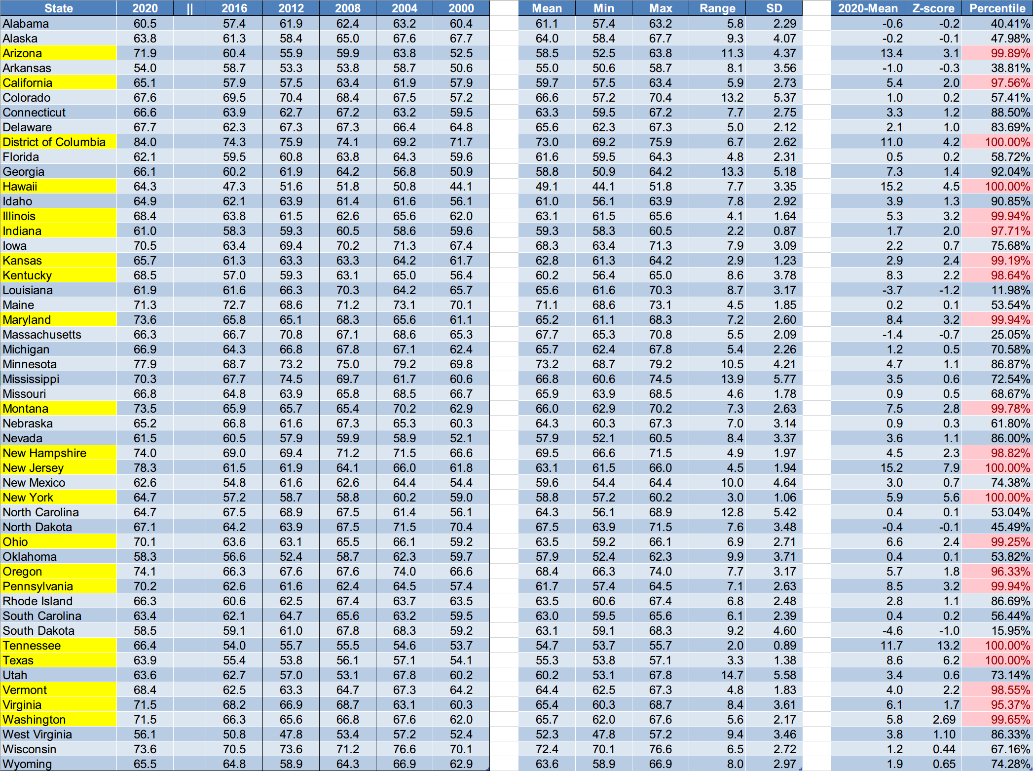
The magnitude of the increase compared to the previous elections is reflected in the right-most column “Percentile”. A value over 95% is classified as rare. Only 5 out of 100 elections would typically end up in this range.
📈 But beyond that, fourteen states have a percentile greater than 99%!
Even though the voting-age population has substantially increased over the years, the increase in voters significantly surpasses what we would expect to be “normal”.
Conclusion
The voting rates in 2020 for nearly half the states, far exceed standard expectations. What would cause such a drastic increase in voter turnout across most of the country? And were all those votes legitimate?
We believe the highlighted states easily warrant further investigations, based on their z-scores and percentile values. Something abnormal happened during the 2020 elections, and these numbers add further weight to the issues already raised.
Many of the states that are not highlighted above still have other notable anomalies. We’ll be applying other analysis techniques in the following articles to bring them to light.
We now have a good grounding to tackle more advanced data analysis techniques in the following articles.
Addendum
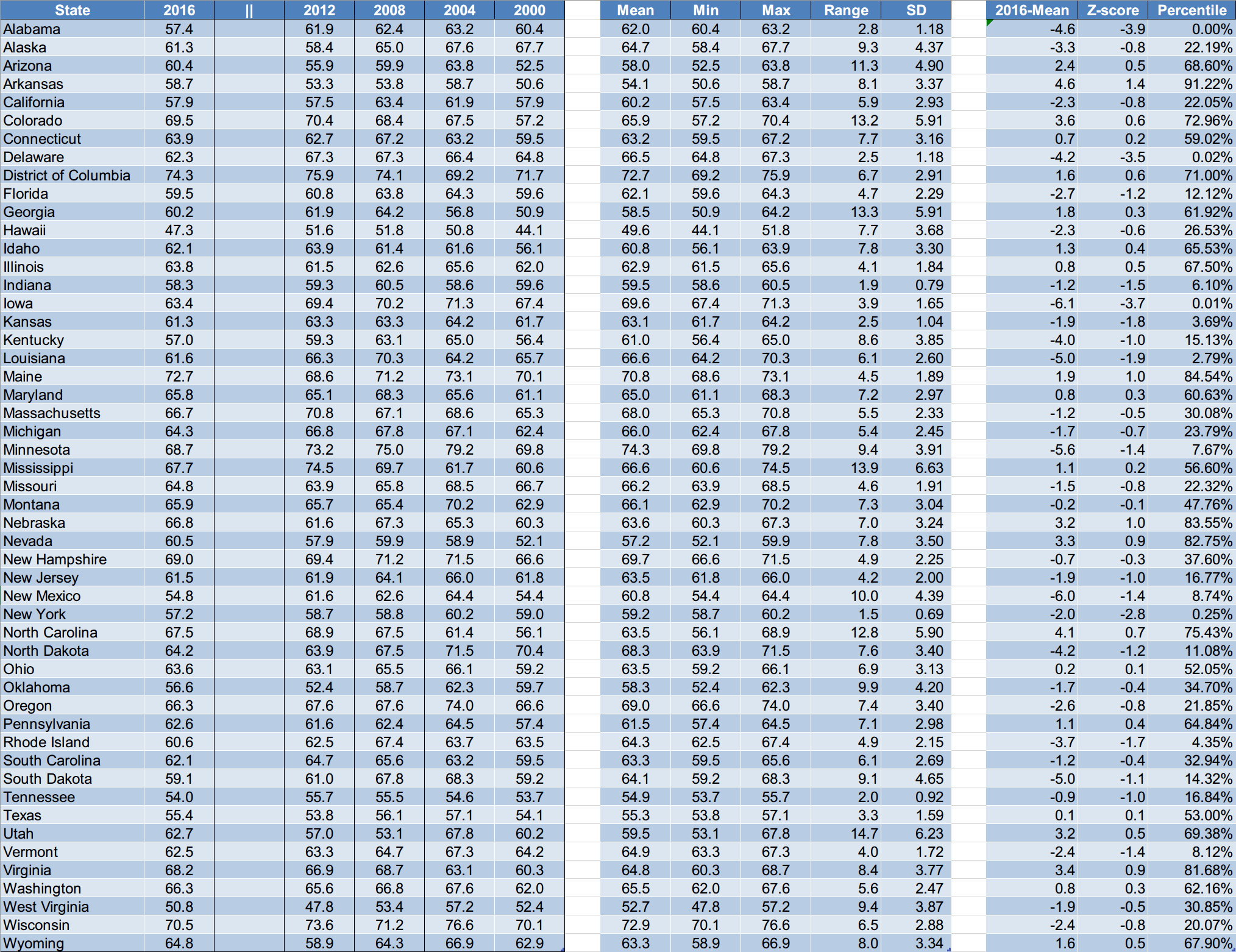
In order to highlight the magnitude of the increase in voting rates in 2020, we did the exact same analysis for 2016. (i.e. Are the voting rates for 2016 “normal” compared to the previous 4 elections?)
The results for 2016 are useful because they help put things “in perspective” and provide a “reference” point for people to get a “sense” for what is normal.
Percentile Analysis
Note that none of the states had a percentile value greater than 95%, so nothing can be highlighted.
On the contrary a lot of states had very low percentile values, which suggests a low turnout compared to the voting-age population.
🤯 Although the 2016 election had more votes than any previous election before it (with 7.5 million extra people voting in 2016 above 2012, or a 5.8% increase), the key concept is that the total votes compared to the voting-age population was relatively low (in “normalized” terms).
The opposite is true for 2020. In “normalized” terms, the 2020 voting rates are uncharacteristically high.
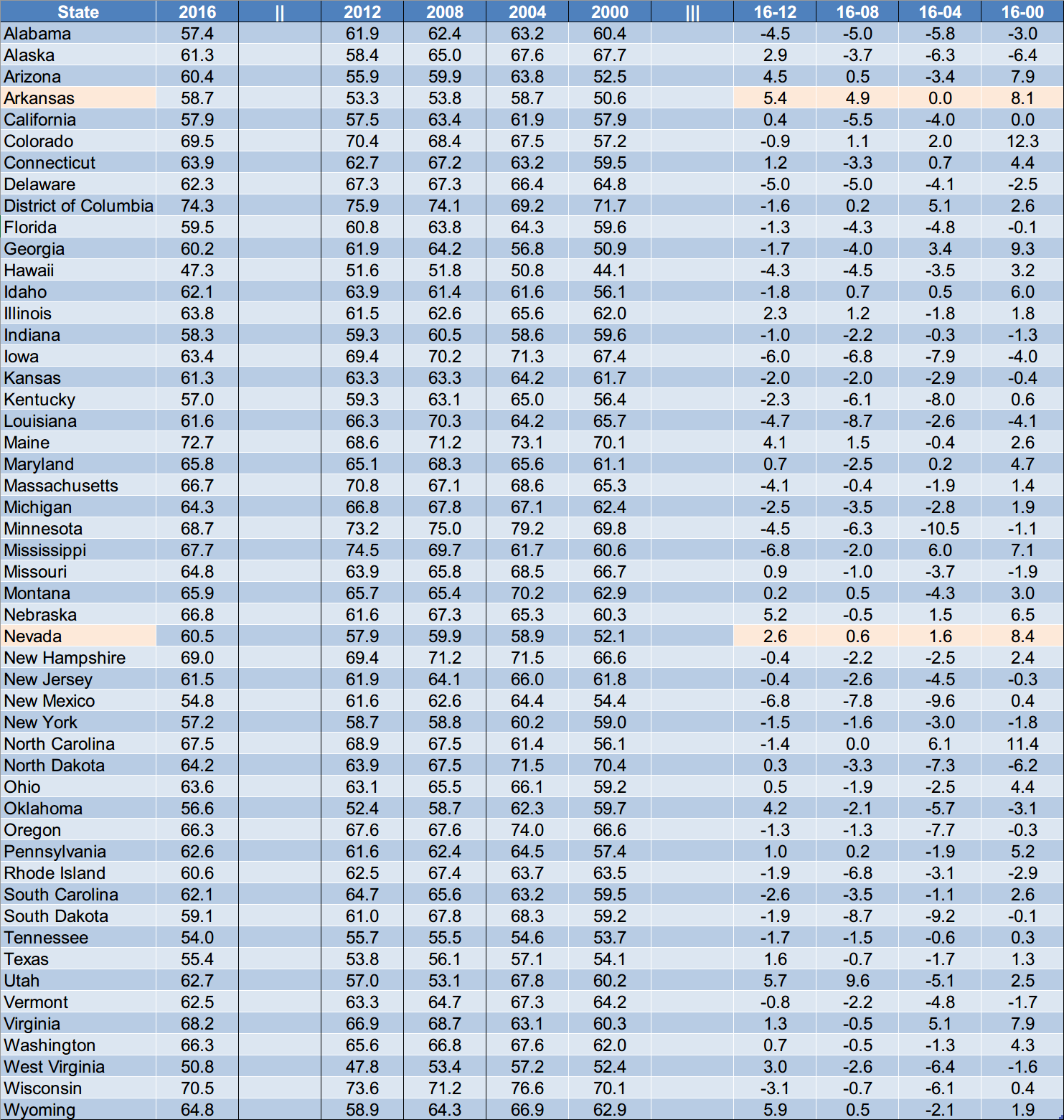
Difference Analysis
Only 2 states had a 2016 voting rate that was greater than all their previous 4 elections. However, the percentile value indicates this is “acceptable”:
Student Analogy
The best analogy we can think of to describe this whole situation is as follows:
Imagine a classroom of high school students taking their end-of-year exam. 10 mins before the exam is meant to finish the fire alarm goes off. The supervisors receive a call telling them a water pipe burst in the garden shed, which is located behind the sports grounds, a good 10 min walk from the exam room, (which happens to be located on the 2nd floor).
As a precautionary measure, the supervisors are told to evacuate the building and to instruct the students to take their exam papers home with them over night.
The following day the students are given extra time to finish the exam, and a week later the results are in.
Miraculously, all the students that consistently scored “D” and “C” all year round, managed to score A and A+ at the end-of-year exam!
It would be suspicious enough if this happened to one or two students, but it happened to nearly half the class!
Anyone in their right mind would suspect wrong doing. In a “sane” world, the exam papers would be scrutinized, however in this case the school board conducted their own “internal investigation” and found the results to be legitimate. In fact they were extremely proud their students did so well because it gives them a good reputation. Case closed.
It was then left to the honest students in the class to get to the bottom of it.
They discovered some disturbing trends:
- The “D” and “C” grade students that scored the highest at the end-of-year exam belong to the “gamers club” and spend all their free time playing computer games in their basements.
- None of them spent any time, whatsoever, studying for the exam.
- Their ring leader, “Joey C’on man”, was even overheard bragging about the fact that he put in place an elaborate plan to “blitz” the exam.
- When the honest students finally got their hands on the exam papers, they found the “open” questions had exactly the same answers. Word for word, including the same spelling mistakes!
They tried bringing their findings to the school board… but would anyone listen to them?
Stay tuned as we follow the data even deeper in the following articles.
Other Articles In This Series
| Overview | Diving deeper into the unusual trends and statistics discovered in the 2020 election. |
| Part 1 | A look at the surprising failure of the bellwether counties in 2020, and what that tells us about the Presidential election outcome. |
| Part 2 | The data shows the Democrats are winning less and less counties at each election, but are winning more and more of the largest counties. How is this possible? |
| Part 3 |
The Curious Case of the 2020 “Voting Rate” Blowouts
Voter turnout rates shot up dramatically in many states in 2020. We look at the voting rates since 2000 to find out which states set a new record.
|
| Part 4 | Learn how to "normalize" a county's winning margin to identify abnormalities. What does this reveal about the 2020 election? |
| Part 5 | Learn how to use the party registration numbers for each county to predict the election results for a state and assess the likely validity of the results. This is a guide on the method Seth Keshel uses for his predictions and county heat maps, allowing you to dig into the trends of your own county and uncover anomalies. |
| Part 6 | We build on some of the previous techniques to scan 3,111 American counties, identifying those whose shift in vote totals moves unexpectedly against the shift in party registrations. |
| Part 7 | We compare the Democrat vote totals with previous elections which reveal some very large increases in unlikely places. |
| Part 8 | We compare key parameters in the 2020 results against the previous five elections using the z-score, and find hundreds of counties breaking statistical norms. |
| Part 9 | Interesting statistical findings on how the Presidential race results compared to the other races in the same election. |
| Part 10 |
Voter Roll Analysis
Coming soon.
|
| Part 11 |
The Art of the Steal
Coming soon.
|
Follow us on Telegram to be notified when we release the remaining articles.
Visitor Comments
Did you find this article helpful? Did you dig in and review the data for your county or state? What did you find? Let us know in the comments below.