📃 This article is Part 7 in a series on Identifying Electoral Fraud Using Trend Analysis.
We recommend reading these preceding articles in order to understand the context and terms used:
In this article we will look at the states and counties with abnormally high increases in Democrat votes, compared with previous elections, including the popular Obama election in 2008.
This will allow us to analyse every single state and county, even the ones that don’t have registration data.
We’ll be looking at categorizing the increase in Democrat votes over the last 3 elections, as well as comparing the 2008 and 2020 Democrat results, to see the relative popularity of Obama (in 2008) against Biden (in 2020).
⚠️ There are many tables in this article and it can quickly become overwhelming. Concentrate on the trends and look for the counties and states you are the most interested in.
Remember… all the images focus on the most suspicious counties.
Looking at Trends in Democrat Votes (DVI)
In the previous article we grouped counties into 4 different categories, depending on whether the voting trends aligned with registration trends for each party. As you may have noticed, many states were missing from the analysis. The reason is that many states don’t keep (or don’t share) registration records by party.
When this is the case we can fall back to analyzing the increase (or decrease) in Democrat Votes (i.e. the DVI value) between elections. This will allow us to analyse every single county in the US, and compare states with each other.
We noticed many counties have negative DVI values in 2012 and 2016. In many cases the 2016 is more negative than in 2012, which clearly indicates the Democrat support is on a downward trend. And yet, in 2020 we see many DVI values surging to unusually high positive values, and bucking the trend. How is this possible?
In order to analyse this phenomenon we created the following categories:
| 0 | Neither 2012 nor 2016 DVI values are negative |
| 0+ | Neither values are negative, but 2016 DVI value is lower than than the 2012 DVI value |
| 1 | One of the DVI values is negative |
| 1+ | The 2016 DVI value is negative (but not 2012) |
| 2 | DVI value is negative in both 2012 and 2016 |
| 2+ | DVI value is more negative in 2016 than in 2012 |
In summary: the higher the number, the stronger the trend is away from the Democrat party.
These values can be found in the new “DVI-Cat” column shown in the image below.
Magnitude: Comparing the 2008 and 2020 DVI Average Percentage Increase
In order to get a feel for the magnitude of the Democrat vote increase in 2020, we will compare the 2020 DVI# against the DVI# established by Obama in 2008.(The values are recorded in the DVI#08 and DVI#20 columns.)
The DVI#08 value provides a good benchmark to compare the DVI#20 value against. It will allow us to determine whether Biden or Obama was the most popular candidate for a given county.
💡 HINT:
Under normal circumstances, whenever the “DVI-Cat” column has a “2” or “2+” we would expect the DVI#20 value to be close to 0% or negative.
Pennsylvania
Here are the results for Pennsylvania. We include it here first in order for you to see how the new columns compare with the RVT columns discussed in the previous article.
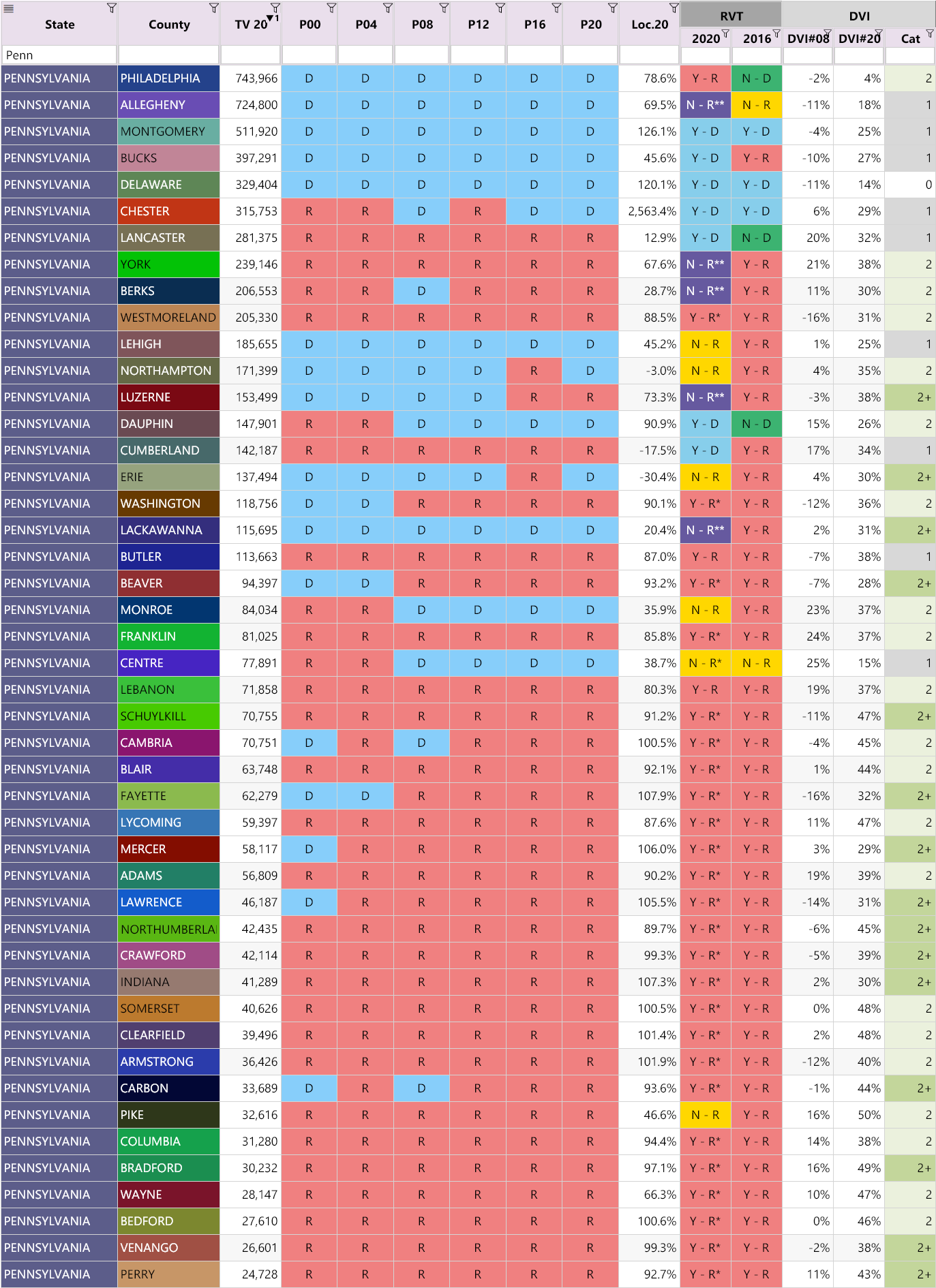
Notice how the DVI#20 values are much higher than the DVI#08 values, which would suggest Biden was much more popular than Obama.
(For some strange reason Philadelphia has the smallest gap. If anyone can suggest why this might be, we would be interested to hear from you via the comments section below.)
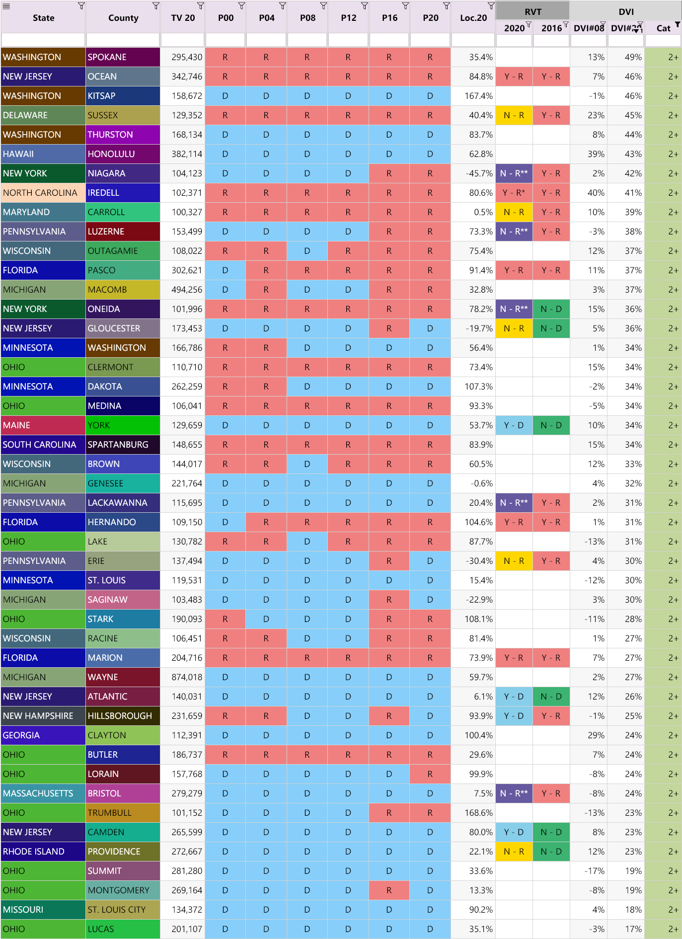
Highest DVI#20 Values Across All Counties
Here are the counties across America that had at least 10,000 votes in 2020, with the highest DVI#20 values, sorted from highest to lowest. (We highlighted all the counties that have a total vote over 50,000 in the TV20 column):
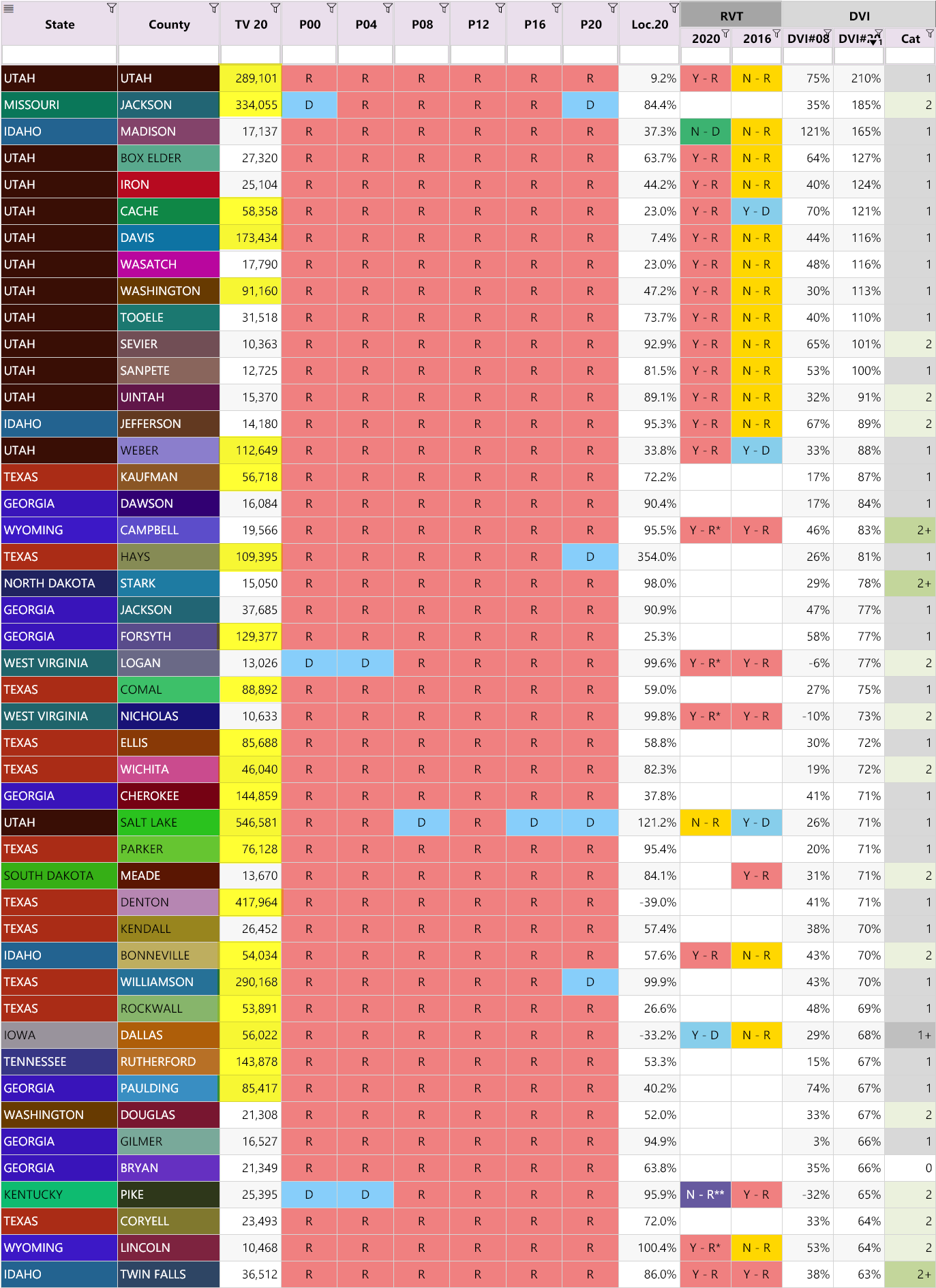
Observations:
The key to understating this analysis is to compare the DVI#20 value against the DVI#08 value and ask yourself: Does the large increase in Democrat votes for Biden make any sense, when compared with the increase in Democrat votes for Obama in 2008?
- A lot of counties from Utah show up in the top 10. (What is going on in Utah?)
- Nearly all these counties are Republican strongholds. (Does it really make sense that the Democrat vote would increase that much? in a Republican county? … Really?)
- Many have abnormal Loc.20 values, which confirms these counties are suspect
- Surprisingly all these counties had at least one election (in 2012 or 2016) with a negative DVI (i.e. Democrats lost votes)
- In nearly all cases the DVI#20 is greater than DVI#08, which indicates Biden was much more popular than Obama, but does that really make sense?
As a reference point, Maricopa County has DVI#08 and DVI#20 values of 6% and 44% respectively.
We know the Democrat vote increase for Maricopa County in 2020 was egregious, but even with a DVI#20 value of 44%, Maricopa county doesn’t make it on the list!
It makes one wonder how much worse the counties on the list are…
Here is the list of counties with at least 100,000 votes in 2020, with the highest DVI#20 values, sorted from highest to lowest. (Notice Maricopa County just made it on the list. Right at the bottom…)
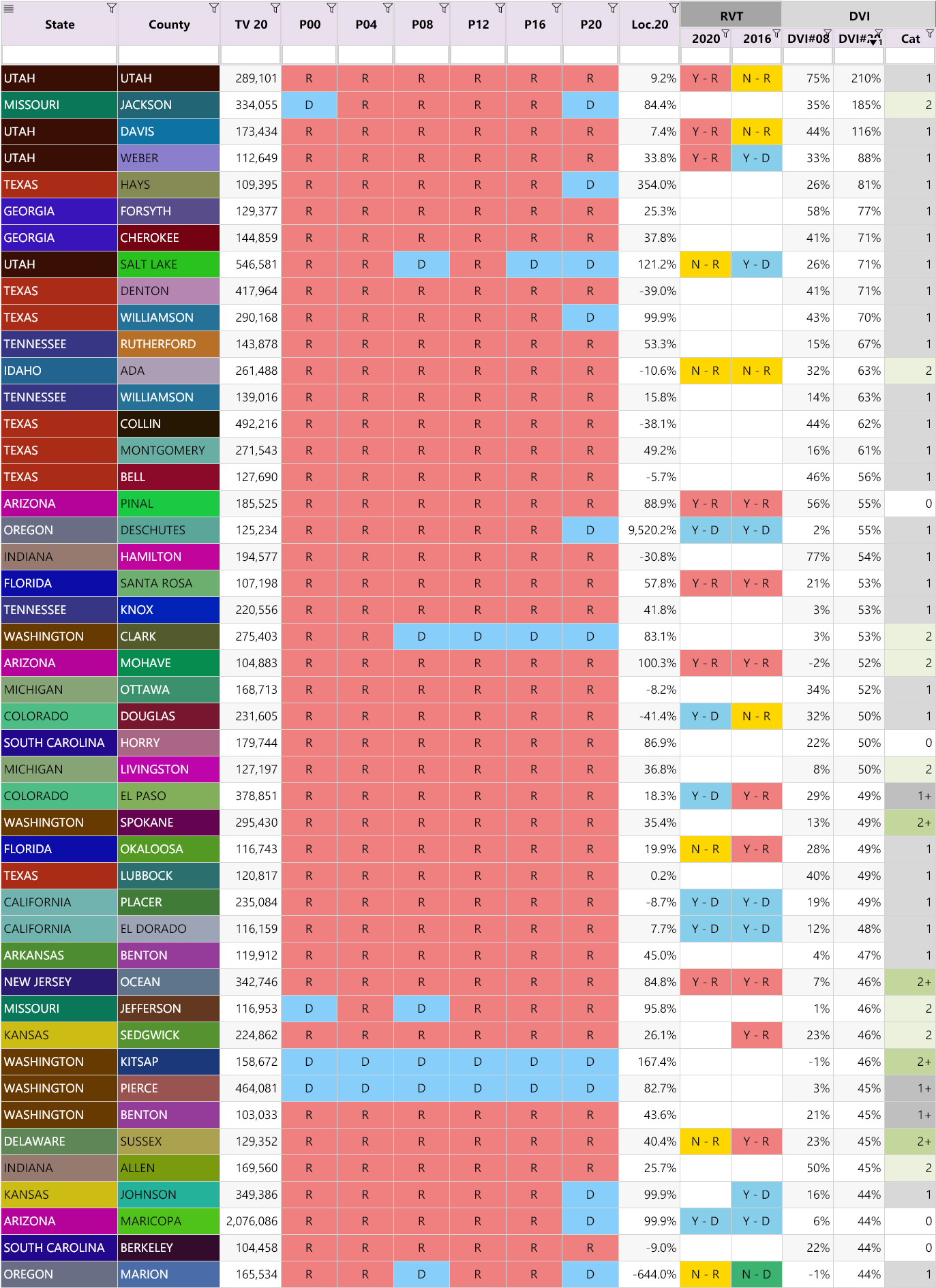
It is surprising how many counties have a DVI-Cat category of “1” or “2”. None of these trends make any sense, especially since most of them are Republican strongholds.
All these counties are suspicious.
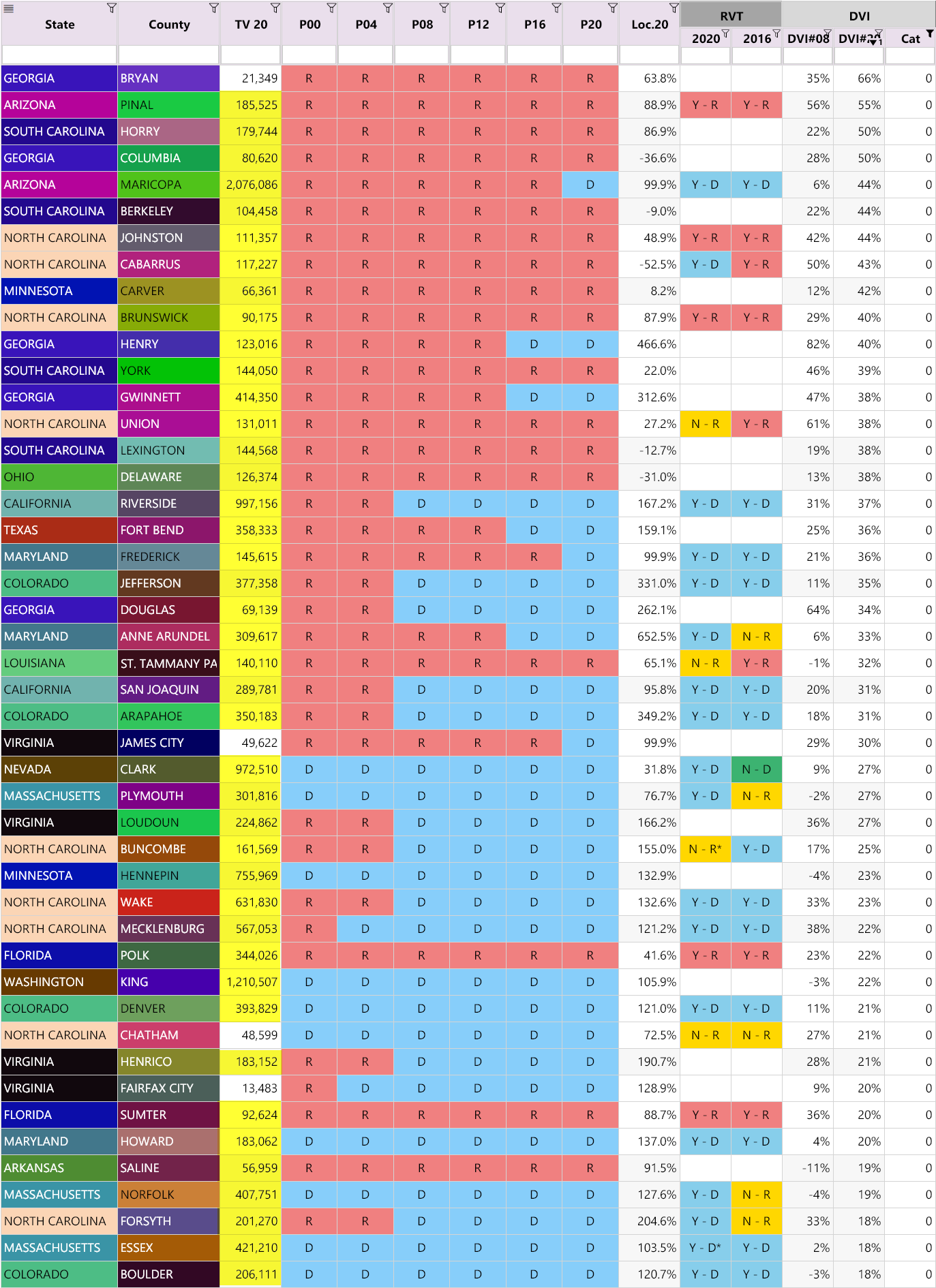
Highest DVI#20 Values for “2+” Counties
Let’s filter our list to show only the sizable “2+” counties — those with decreasing Democrat votes between 2012-2016, with at least 10,000 votes in 2020, sorted from highest to lowest DVI#20 values.
Remember the hint at the beginning of the article?
💡 HINT:
Under normal circumstances, whenever the “DVI-Cat” column has a “2” or “2+” we would expect the DVI#20 value to be close to 0% or negative.
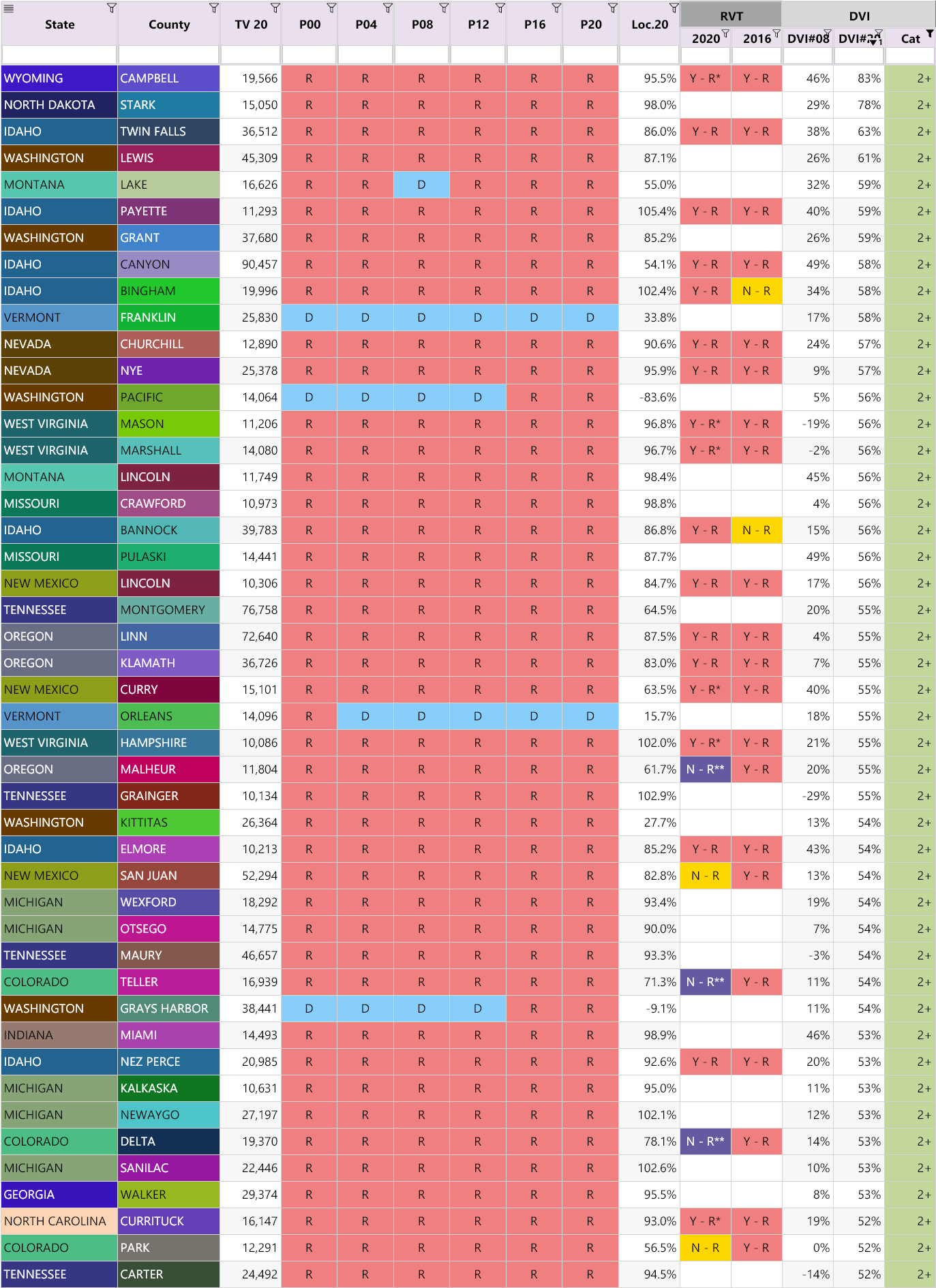
Observations:
- All these counties have a negative DVI downward trend, but “bucked” the trend in 2020 with a very large positive value
- Nearly all these counties are Republican strongholds
Here is the list of counties, using the same “2+” filter with at least 100,000 votes in 2020, sorted from highest to lowest DVI#20:
Observations:
- The difference between DVI#08 and DVI#20 values is large. It would appear Biden was much more popular than Obama. But does that really make sense, especially in Democrat strongholds?
- The Loc.20 values for nearly all these counties are abnormal
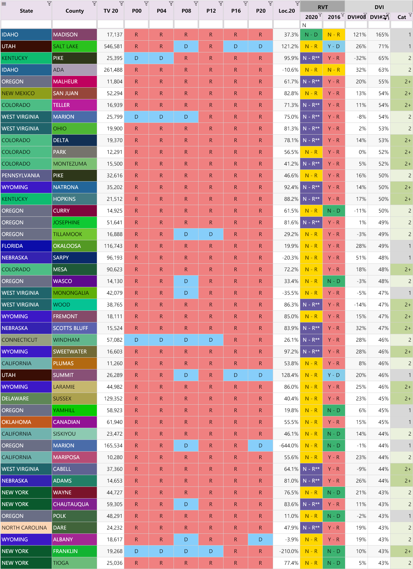
Highest DVI#20 Values for “0” Counties
Let’s now change the filter to only show the “0” counties. That’s those with a trend of increasing Democrat votes 2008-2016, with at least 10,000 votes in 2020, sorted from highest to lowest DVI#20 values. (We highlighted all the counties that have a total vote over 50,000 in the TV20 column):
Observations:
- All these counties have a positive DVI upward trend
- Most of the top 10 counties are Republican strongholds (Why are they becoming more and more Democrat?)
- There is a disproportionate amount of large counties (Coincidence?)
- Even in the Democrat strongholds, Biden is more popular than Obama, a lot of the time… Does that really make any sense?
Highest DVI#20 Values for Counties with a Trend-Bucking RVT in 2020
We’ll now filter by just the counties where the vote counts trended in the opposite direction to the trend in party registrations — that is, all counties with an “N” RVT 2020 category, that had at least 10,000 votes in 2020, sorted from highest to lowest DVI#20 values.
(The “RVT” concept was discussed in Part 6.)
Observations:
- A lot of Oregon and Colorado counties
- Big difference between DVI#20 and DVI#08 across many counties
- Abnormal Loc.20 values
In order to make it crystal clear, this table demonstrates how 3 completely independent analyses (Loc.20, RVT category and DVI#20 values), all point to the same conclusion: The 2020 election results are abnormal, affect nearly every state, and require further investigations.
DVI#20 Values Greater than 50%, By State
We discovered an astounding number of counties that dramatically increased their Democrat votes, with a DVI#20 value greater than 50%.
Due to the large number, we had to show this list on it’s own page (!):
Show Full List of DVI#20 Values Greater than 50%, By State
Observations:
All the counties listed in the tables are worth looking into more closely, however the following patterns in the following states are most troubling:
- States with the largest differences between DVI#08 and DVI#20:
- Colorado
- Illinois
- Kansas
- Kentucky
- Michigan
- Missouri
- New Jersey
- North Dakota
- Oregon
- Pennsylvania
- South Dakota
- Tennessee
- Texas
- Utah
- Vermont
- Virginia
- Washington
- West Virginia
- States with the highest DVI#20 values:
- Georgia
- Idaho
- South Dakota
- Texas
- Utah
- Virginia
- West Virginia
- Wyoming
- States with the most counties with DVI#20 values greater than 50% (Were they trying to turn some of these states blue?):
- Georgia
- Idaho
- Indiana
- Kansas
- Montana
- Nebraska
- South Dakota
- Tennessee
- Texas
- Utah
- West Virginia
Summary
We identified very large increases in Democrat votes in 2020, far beyond what occurred in previous elections. We believe many of these are suspicious anomalies that require further investigation.
These analyses form a nomological network or set of independent measurements that, when combined, provide a coherent and consistent body of truth that is unassailable.
With so many counties bucking trends and setting new turnout records, combined with the reports of poor security and election mishandling, the results do look suspect. We believe contacting voters directly (canvassing) combined with forensic audits (where necessary) is crucial to conclusively determining the validity of the election.
Our next article, z-Score Trend Anomalies looks at interesting statistical findings from the 2020 results and how certain key parameters are highly unlikely.
Other Articles In This Series
| Overview | Diving deeper into the unusual trends and statistics discovered in the 2020 election. |
| Part 1 | A look at the surprising failure of the bellwether counties in 2020, and what that tells us about the Presidential election outcome. |
| Part 2 | The data shows the Democrats are winning less and less counties at each election, but are winning more and more of the largest counties. How is this possible? |
| Part 3 | Voter turnout rates shot up dramatically in many states in 2020. We look at the voting rates since 2000 to find out which states set a new record. |
| Part 4 | Learn how to "normalize" a county's winning margin to identify abnormalities. What does this reveal about the 2020 election? |
| Part 5 | Learn how to use the party registration numbers for each county to predict the election results for a state and assess the likely validity of the results. This is a guide on the method Seth Keshel uses for his predictions and county heat maps, allowing you to dig into the trends of your own county and uncover anomalies. |
| Part 6 | We build on some of the previous techniques to scan 3,111 American counties, identifying those whose shift in vote totals moves unexpectedly against the shift in party registrations. |
| Part 7 |
Investigating the Large Democrat Vote Increases
We compare the Democrat vote totals with previous elections which reveal some very large increases in unlikely places.
|
| Part 8 | We compare key parameters in the 2020 results against the previous five elections using the z-score, and find hundreds of counties breaking statistical norms. |
| Part 9 | Interesting statistical findings on how the Presidential race results compared to the other races in the same election. |
| Part 10 |
Voter Roll Analysis
Coming soon.
|
| Part 11 |
The Art of the Steal
Coming soon.
|
Follow us on Telegram to be notified when we release the remaining articles.
Visitor Comments
Did you find this article helpful? Did you dig in and review the data for your county or state? What did you find? Let us know in the comments below.