📃 This article is part of a series on Identifying Electoral Fraud Using Trend Analysis.
Please carefully read the Down Ballot Election Analysis Guide, which explains this analysis in detail and includes 2 worked examples for Williamson and Tarrant county, Texas.
The guide provides a “fine-grained” analysis of the dynamics taking place at the county level.
⚠️ If you are short on time, it is worth reading the summary of the Williamson and Tarrant county down ballot analysis. They are very compelling.
Analyzing the county level race results can be very insightful in and of itself. However, it is important to realize that the “Historical County Range Analysis”, the “Historical County Analysis (with Registration data)” and the “Down Ballot County Election Analysis” all complement each other.
They all provided different pieces of the same puzzle. When we are able to perform all three, we get a much clearer picture of what is really going on.
For those willing to look carefully and let the data speak for itself, we can identify trends that need to be investigated further.
For example let’s look at Pulaski in Arkansas.
NOTE: This complements the “Historical County Range Analysis” we previously did for this county.
Pulaski, AR
Here are some screenshots taken from the official Pulaski county website, which contain the official election results from 2012, 2016 and 2020. (See references below.)
Study them carefully. Look for trends within an election and across elections.
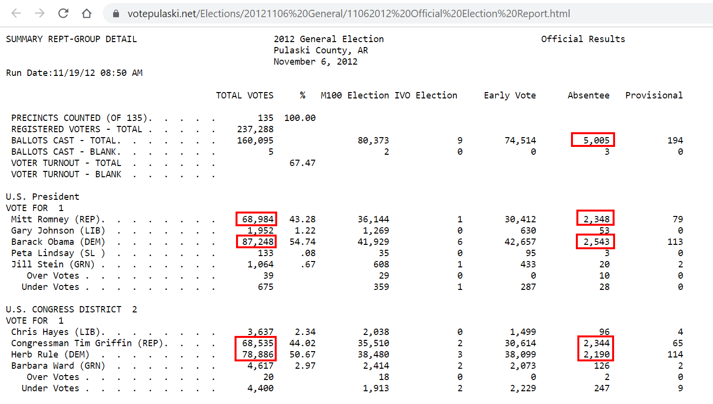
Pulaski 2012
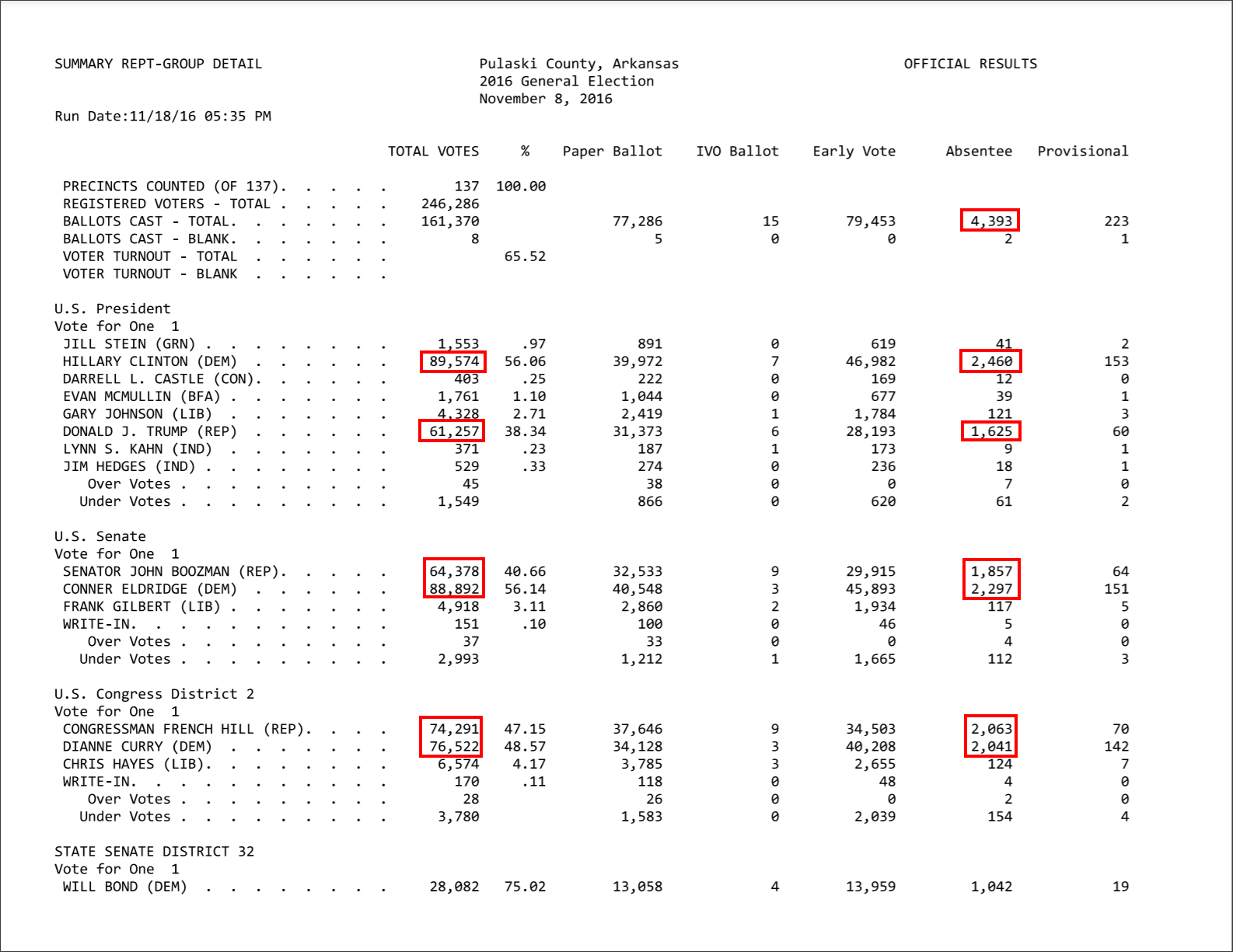
Pulaski 2016
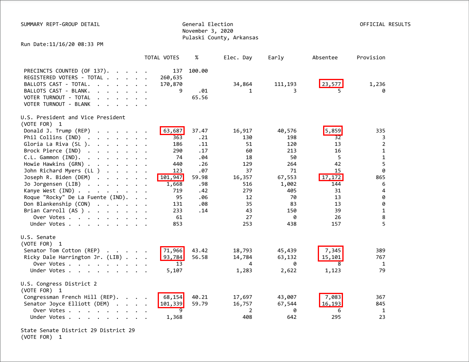
Pulaski 2020
Observations
- Keep in mind that Arkansas is one of the CLEANEST states
- Absentee votes trend:
- 2012: 5,005
- 2016: 4,393
- 2020: 23,577
- Total Republican votes trend (For Presidential race):
- 2012: 68,984
- 2016: 61,357
- 2020: 63,687
- Total Democrat votes trend (For Presidential race):
- 2012: 87,248
- 2016: 89,574
- 2020: 101,947
- Keep in mind that if we look at all the other AR counties we see a very strong move towards the Republican party… (Refer to the “Historical County Range Analysis” case study for AR.)
- In 2012 the Congress district race for the Democrat candidate had 78,886 votes. Where did the other 10K votes go?… putting it another way… Where did the extra 10K votes for the Democrat Presidential candidate (87,248) come from?
- Similar question for the 2016 election. The Congress district race had 74,291 votes for the Republican party and 76,5622 for the Democrat party. Republicans had 10K more votes than the Senate and Presidential race. And the Democrats have (approximately) 10K less votes than the Senate and Presidential race…
- In 2020. Finally… the numbers across all races look a lot more consistent. Yay! Nothing to see here folks. Oh, yes, the absentee votes… Obviously, everyone knows that makes total sense. If you still have doubts then the answer is “COVID”. See… makes perfect sense. Move on…
- Remember, Arkansas is one of the CLEANEST states…
References
Links to Pulaski election results:
- 2020: https://www.votepulaski.net/Elections/2020/2020GenElec11032020/OfficialResults/11032020%20Official%20Election%20Summary.pdf
- 2016: https://votepulaski.net/Elections/2016_Elections/11082016%20Official%20Election%20Summary.pdf
- 2012: https://www.votepulaski.net/Elections/20121106%20General/11062012%20Official%20Election%20Report.html
Summary
A “Down Ballot” analysis is a powerful method for discovering trend anomalies within electoral county races.
We would encourage everyone to take the time to read the Down Ballot Election Analysis Guide and analyze the county they live in for themselves.
Other Articles In This Series
| Overview | Diving deeper into the unusual trends and statistics discovered in the 2020 election. |
| Part 1 | A look at the surprising failure of the bellwether counties in 2020, and what that tells us about the Presidential election outcome. |
| Part 2 | The data shows the Democrats are winning less and less counties at each election, but are winning more and more of the largest counties. How is this possible? |
| Part 3 | Voter turnout rates shot up dramatically in many states in 2020. We look at the voting rates since 2000 to find out which states set a new record. |
| Part 4 | Learn how to "normalize" a county's winning margin to identify abnormalities. What does this reveal about the 2020 election? |
| Part 5 | Learn how to use the party registration numbers for each county to predict the election results for a state and assess the likely validity of the results. This is a guide on the method Seth Keshel uses for his predictions and county heat maps, allowing you to dig into the trends of your own county and uncover anomalies. |
| Part 6 | We build on some of the previous techniques to scan 3,111 American counties, identifying those whose shift in vote totals moves unexpectedly against the shift in party registrations. |
| Part 7 | We compare the Democrat vote totals with previous elections which reveal some very large increases in unlikely places. |
| Part 8 | We compare key parameters in the 2020 results against the previous five elections using the z-score, and find hundreds of counties breaking statistical norms. |
| Part 9 |
Down Ballot Election Analysis
Interesting statistical findings on how the Presidential race results compared to the other races in the same election.
|
| Part 10 |
Voter Roll Analysis
Coming soon.
|
| Part 11 |
The Art of the Steal
Coming soon.
|
Follow us on Telegram to be notified when we release the remaining articles.
Visitor Comments
Did you find this article helpful? Did you dig in and review the data for your county or state? What did you find? Let us know in the comments below.