📃 This article is Part 8 in a series on Identifying Electoral Fraud Using Trend Analysis.
We recommend reading these preceding articles in order to understand the context and terms used:
We discussed the z-score concept in Part 3: The Curious Case of the 2020 “Voting Rate” Blowouts.
The z-score gives us an indication of how far a value is from the mean, when measured in standard deviation units.
It allows us to normalize results across multiple datasets in order to compare them with one another.
💡 A Quick Refresher on Z-Scores:
A z-score of “0” would indicate the assessed value is equal to the mean of all the other values in the dataset.
A z-score of “2” would indicate the assessed value is 2 standard deviation units away from the mean.
When the values in a dataset follow a normal distribution, a z-score greater than 2.5 is rare.
If a dataset contained 100 values, we would only expect one value to have a z-score greater than 2.5.
A z-score greater than 3 is extremely unlikely. In fact, in a lot of data analysis and machine learning scenarios, a value with a z-score greater than 3 is considered an “outlier”. i.e. the value is removed from the analysis because it is considered so rare that it must be an “anomaly”. Let that sink in.
We can calculate z-scores for all key parameters, discussed in the previous articles, which will allow us to compare the 2020 results with the previous 5 elections, to quickly identify the 2020 values that look unlikely.
The most important parameters are:
| T/DR | Total Democrat votes divided by Democrat registrations |
| DVI | Democrat Vote Increase (from previous election) |
| RVI | Republican Vote Increase (from previous election) |
| TI/TRI | Total Vote Increase divided by Total Registration Increase |
| TV | Total Votes |
| TR | Total Registrations |
Not all states provide registration data, so we can’t calculate the T/DR for all states. However we can calculate the DVI for every state, so we will look at the zDVI score first.
Looking at Democrat Vote Increases: The DVI Z-Score (zDVI)
We calculated the DVI for all counties in all states, and then determined the z-score for each DVI in 2020 (in the zDVI column). We then filtered the list to only display the counties with a DVI z-score greater than 2.5.
💡 TIP:
A z-score of 2.5 will put the value in the 99% percentile. In other words we should only expect to see such values once in every 100 elections.
A z-score greater than 3 is extremely unlikely. (Remember, in many data analysis scenarios these values are considered so rare that they are called “outliers” and removed from the dataset.)
There are over 388 counties across 37 states that have a zDVI score greater than 2.5! So we had to display the images on their own page:
Show Full List of zDVI Values Greater than 2.5, By State
🤯 For comparison, if we compare the 2016 election results with the previous 4 elections, we only get five counties with a zDVI greater than 2.5. In 2020, there was suddenly 388!
Summary:
These are the states with the most counties with a zDVI score greater than 2.5:
- Texas has 73
- Georgia has 51
- Kansas has 27
- Washington has 22
- Oklahoma has 21
- Tennessee has 21
- Kentucky has 18
- Oregon has 17
- New York has 11
- California has 11
- Utah has 11
- Colorado has 10
- Arizona has 10
- South Carolina has 9
- Alabama has 9
- Florida has 7
- Virginia has 6
A state that is notably missing is Pennsylvania… which makes one wonder how much worse the states in the list above are!
Observations:
- A lot of the counties with a zDVI score greater than 2.5 are Republican strongholds. They have consistently voted Republican since (at least) the year 2000. Does it really make any sense that the Democrat Vote Increase (DVI) would set new records in 2020, in such counties?
- Whenever a county has a large zRVI (Republican) score it is often eclipsed by an even larger zDVI score, especially in the larger counties. (Coincidence?)
- The fact that so many counties across so many states have abnormally high z-score values is troubling (to say the least).
A Look at Democrat Voter Turnout Rates: The T/DR Z-Score (zTDR)
As we have mentioned previously, we can only calculate the T/DR ratio (i.e the Democrat votes divided by the Democrat registrations), if a state provides registration data by party.
When we do have access to the registration data, we believe an “abnormal” T/DR value is the most powerful indicator of suspicious activity within a county.
There are over 331 counties across 17 states that have a zTDR score greater than 2.5, so again we had to display the images on their own page:
Show Full List of zTDR Values Greater than 2.5, By State
🤯 Again, for comparison, if we compare the 2016 election results with the previous four elections, we only get thirteen counties with a zTDR greater than 2.5. In 2020 it jumped to 331!
Summary:
These are the states with the most counties with a zTDR score greater than 2.5:
- North Carolina has 67
- Oklahoma has 49
- Florida has 34
- Louisiana has 33
- Pennsylvania has 24
- Oregon has 21
- Kentucky has 15
- Maryland has 10
- Massachusetts has 9
- Arizona has 7
Observations:
- What happened in Oklahoma, Oregon, Nebraska, Louisiana, Kentucky and North Carolina? All these counties are Republican strongholds!
- Many of the counties with high zTDR scores are different to the counties with high zDVI scores. This is concerning because that does not leave us with a lot of counties with low z-scores.
- Only 17 states provide full registration data by party. Imagine how many more counties with zTDR values greater than 2.5 there would be, if we had registration data for all 50 states.
2016 Comparison
Here are the 17 counties that have either their zDVI or zTDR value greater than 2.5 at the 2016 election:
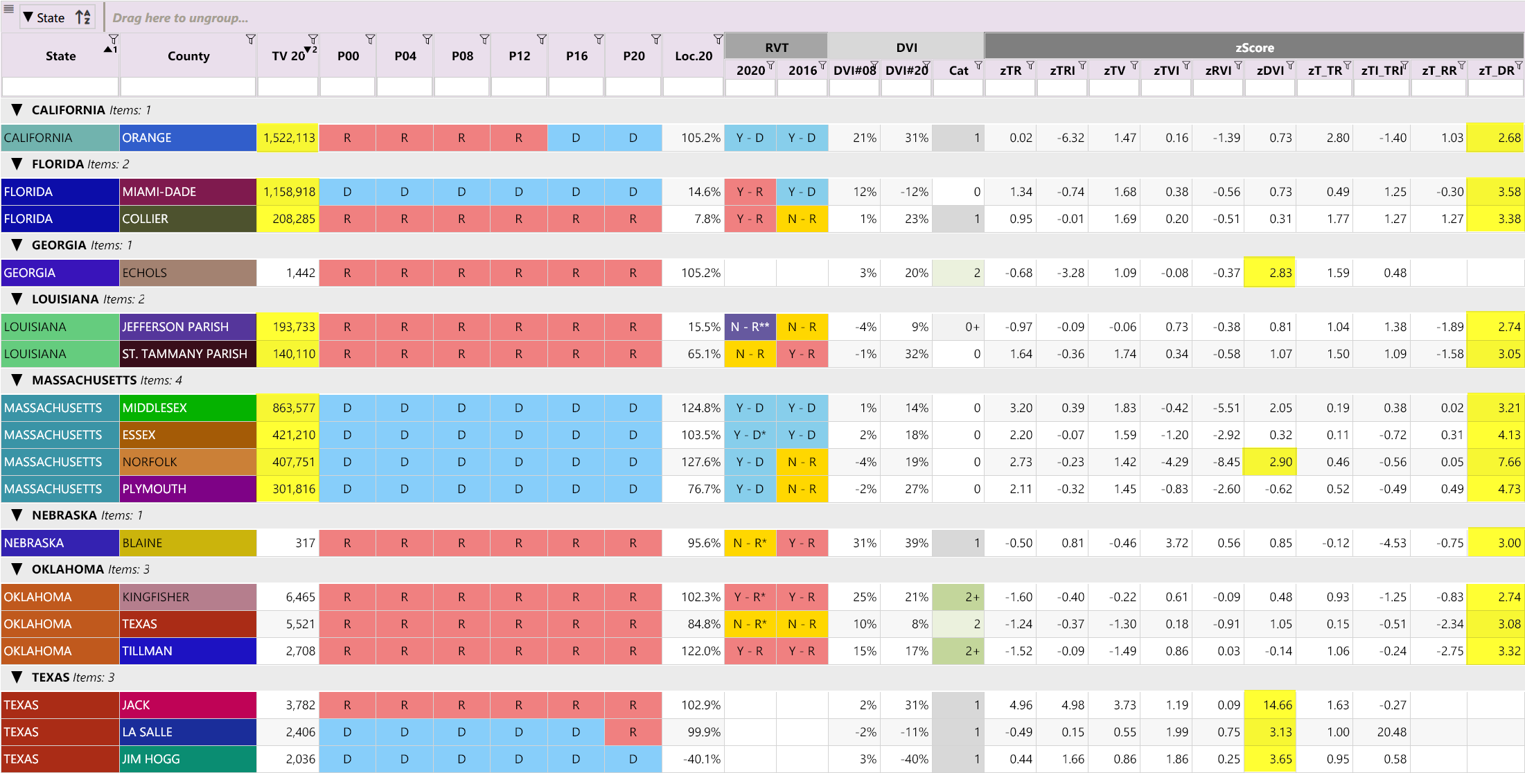
In 2020, the number of counties with either a zDVI or zTDR value greater than 2.5 ballooned to 647. (As we noted above, 388 counties have a zDVI greater than 2.5 and 331 counties have a zTDR greater than 2.5.)
Observations:
- It is remarkable that there is so little overlap between counties with large zDVI and zTDR values
- Unsurprisingly, many of the “anomalous” counties in 2016 are very large counties (based on the total votes shown in the “TV 20” column)
- Orange County, CA, voted Democrat for the first time in a long time in 2016, after a huge Democrat surge (and an even bigger surge in 2020)
- Miami-Dade, FL, had a large Democrat surge in 2016, which then completely collapsed in 2020. What happened? Why such a big change of heart?
- Massachusetts has large counties with extremely unlikely z-scores in 2016 😱, and even higher (much higher!) z-scores in 2020. (Yes, that is a big give away 😉)
Full County Analysis by State
Here is the CSV file containing the complete analysis for ALL counties in ALL states.
You can use this CSV file to look at your county and compare it with other counties in your state.
Remember: any z-score, in any column, that is greater than 2.5 is suspicious and would warrant further investigation.
The table includes the following analyses:
- Winning Range analysis (Loc.20)
- Registration and Vote trend analysis (RVT category: N-R and N-D)
- 2012 and 2016 Negative DVI value categorization (DVI-Cat)
- DVI# for 2008 and 2020 (Comparing Obama’s results with Biden’s)
- Z-scores of all key parameters
Summary
The z-score is an impartial measurement for classifying values within a dataset.
During a normal election we would only expect to find a handful of counties with high z-score values, above 2.5, like in 2016. Here’s the comparison again:
| Election | Based on Democrat Vote Increase | Based on Democrat Turnout |
|---|---|---|
| 2016 | 5 counties over 2.5 | 13 counties over 2.5 |
| 2020 | 388 counties over 2.5 | 331 counties over 2.5 |
We only focused on the DVI and T/DR values in this article, however other important parameters, such as RVI, TR, and TV, all display troubling z-score values as well.
The 2020 election had hundreds of counties with extremely high z-score values. The quantity and magnitude of the z-scores indicate the results are extremely unlikely.
(Just think of the odds that the same person would be struck by lightening 3 years in a row, at exactly the same location, on the same date, at exactly the same time, wearing exactly the same clothes, with Mars, Venus and Neptune being aligned, during a total solar eclipse, without a single cloud in the sky. Yes… extremely unlikely!)
These unlikely values are consistent with our other findings and point to the fact that more needs to be done to investigate the 2020 election.
The data speaks for itself.
At this stage of the analysis the evidence is overwhelming. We’d even venture to say that anyone refusing to take this seriously and allow independent audits of the election is either willfully blind or complicit. We call on all officials and state representatives to look openly and transparently at the results and allow the US public to verify that the election was run honestly and securely.
Stay tuned for our next article on Down Ballot Analysis, where we look at interesting statistical findings on how the Presidential race results compared to the other races in the same election.
Other Articles In This Series
| Overview | Diving deeper into the unusual trends and statistics discovered in the 2020 election. |
| Part 1 | A look at the surprising failure of the bellwether counties in 2020, and what that tells us about the Presidential election outcome. |
| Part 2 | The data shows the Democrats are winning less and less counties at each election, but are winning more and more of the largest counties. How is this possible? |
| Part 3 | Voter turnout rates shot up dramatically in many states in 2020. We look at the voting rates since 2000 to find out which states set a new record. |
| Part 4 | Learn how to "normalize" a county's winning margin to identify abnormalities. What does this reveal about the 2020 election? |
| Part 5 | Learn how to use the party registration numbers for each county to predict the election results for a state and assess the likely validity of the results. This is a guide on the method Seth Keshel uses for his predictions and county heat maps, allowing you to dig into the trends of your own county and uncover anomalies. |
| Part 6 | We build on some of the previous techniques to scan 3,111 American counties, identifying those whose shift in vote totals moves unexpectedly against the shift in party registrations. |
| Part 7 | We compare the Democrat vote totals with previous elections which reveal some very large increases in unlikely places. |
| Part 8 |
Unlikely Z-Score Values
We compare key parameters in the 2020 results against the previous five elections using the z-score, and find hundreds of counties breaking statistical norms.
|
| Part 9 | Interesting statistical findings on how the Presidential race results compared to the other races in the same election. |
| Part 10 |
Voter Roll Analysis
Coming soon.
|
| Part 11 |
The Art of the Steal
Coming soon.
|
Follow us on Telegram to be notified when we release the remaining articles.
Visitor Comments
Did you find this article helpful? Did you dig in and review the data for your county or state? What did you find? Let us know in the comments below.