📃 This article is part of a series on Identifying Electoral Fraud Using Trend Analysis.
The voter rolls for each state and county provide a wealth of information to explore.
Many other data analysts have made meaningful and compelling discoveries in this area. (Link to Dr Frank, Draza Smith and Bobby Pitton)
Our analysis is influenced by Dr. Frank’s research and is focused on analyzing the “Votes / Registrations” ratio for each county, from a different perspective.
This analysis is best explained by looking at a concrete example: New Mexico.
NOTE: None of the following results would have been possible without the support and guidance from Erin Clements. She provided us with deep local knowledge and insights. These are the fruits of her work. Thank you Erin.
“Votes / Registrations” ratio trend by age group (Case Study: New Mexico)
This case study can be used as a template for others to perform the same analysis on voter roll records for other states.
Voter roll results that are similar to the one in New Mexico should be immediately and systematically decertified.
“Fraud” is not the right word to describe what is happening here. (We haven’t found the right word yet, but “auto-pilot” and “pre-defined” come close).
We have good reason to believe the same “strategy” and algorithms are being used in other states.
The analysis could not be simpler, nor more conclusive.
We will gladly assist others looking to perform this analysis on their state voter roll records.
NOTE: The results shown in the following images are directly derived from the official voter rolls from New Mexico state. Enjoy!
The voter rolls for a given state provide us with a wealth of information to analyze. They contain information on every registered voter, their affiliation, date of birth, and whether they voted at the the General election, and how they voted (i.e. either as absentee, early or the the same day as the election), but not who they voted for.
This is all the information we need to conduct our analysis.
Before we dive in, we would like to re-emphasize the importance of the “votes / registration” ratio. As we demonstrated in the Historical County Analysis with Registration Data section the “votes / registration” ratio can be effectively used to identify anomalies in historical voter trends and is the critical parameter we use to estimate the number of excess (or shortfall) votes for a given party.
We referred to this ratio as the T/DR or T/RR which corresponds to the “Turnout / Registration” for the Democrat and Republican party respectively.
We already know this ratio is important, and after analyzing hundreds of individual counties with party registration information, we have been able to establish that the T/DR (and T/RR) is a very reliable and stable ratio. We believe the reason for this is psychological, as it fundamentally relates to “behavioral patterns” that are characteristic of each party. Human behaviors do not change easily, so when we see large fluctuations in this ratio, it raises cause for concern.
It is important to note that voter rolls do not have information on which party a person voted for. They only contain information regarding a person’s affiliation.
Dr. Frank has done a lot of compelling analysis of voter rolls and has found abnormally high correlations of “votes / registration” ratio trends, when plotting this ratio for each age group and comparing the results across all the counties belonging to a given state.
The “abnormality” comes from the fact that the results across all the counties (for a given state) are way too consistent. They are so consistent that he is able to predict the voter turnout for any age group with extreme accuracy, when he is given the registration number for that age group.
In other words, once he has established the “votes / registration” ratio for each age group for one county. He is able to accurately predict the number of people who voted in all the other counties, when given the registration number for a particular age group.
If this sounds highly suspicious to you, it should. In a “real” world scenario the odds of this occurring naturally are extremely remote. Not only is it extremely unlikely for all the counties in ONE state to have this characteristic, Dr. Frank has successfully identified this pattern in multiple states! (Which makes the odds of this happening naturally virtually impossible.)
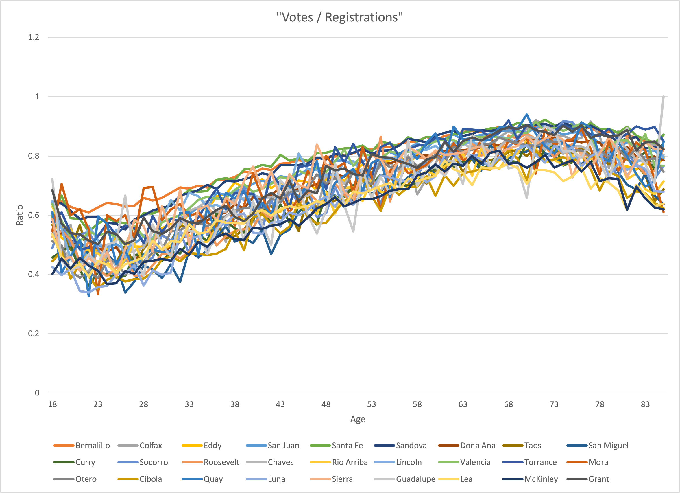
With this in mind we simply decided to look at the “votes / registration” (v/r) ratio for each age for Bernalillo county NM, which is the most populated county in NM.
Here is the plot:
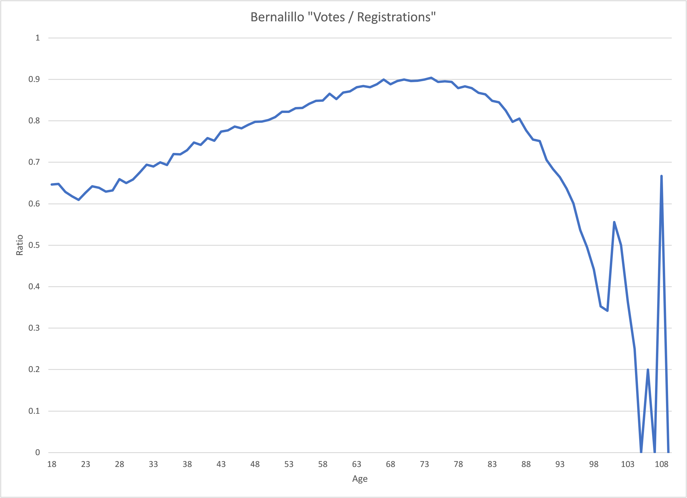
The result was very surprising to us. The curve is way too smooth and follows a predictable curve.
So we decided to plot the “v/r” ratio for several of the other most populated counties in NM and got the following result:
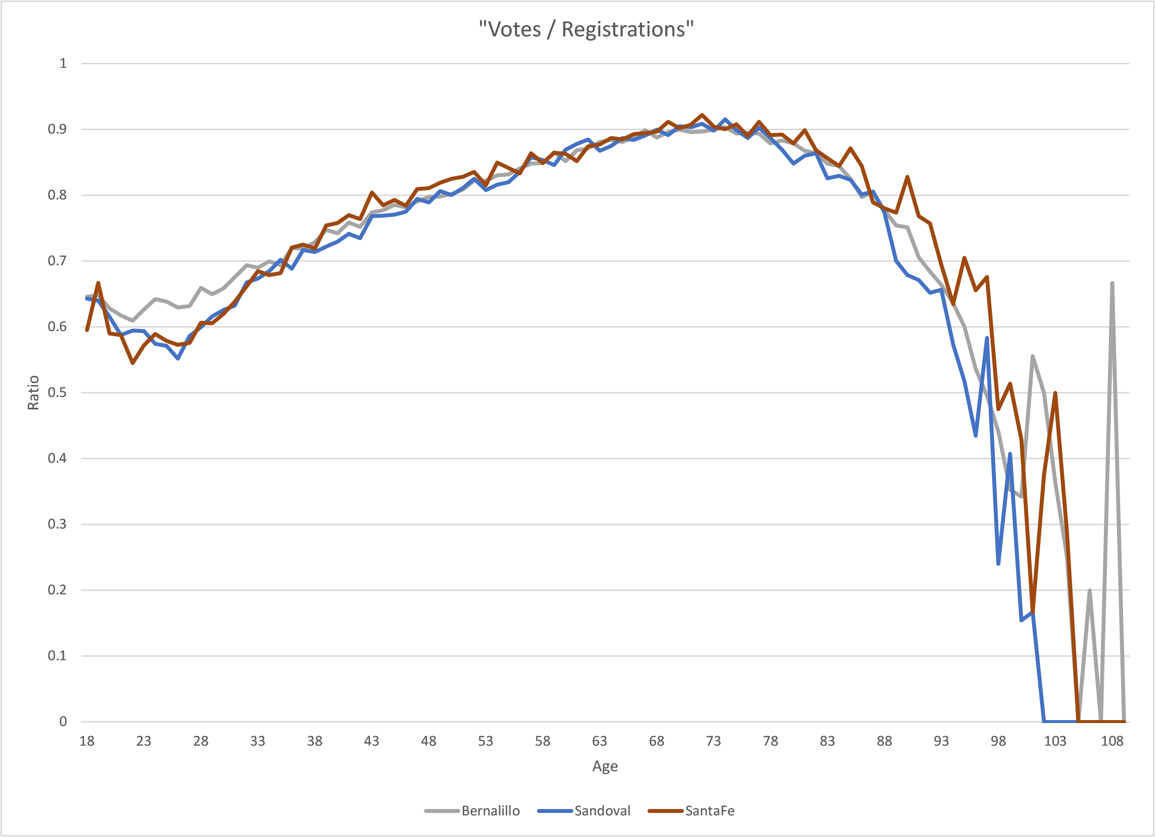
This is even more puzzling (!). All the counties follow very similar trends up to the 85 year old mark.
This is clearly abnormal. However, it is hard for people who do not deal with “trends” and data on a daily basis to fully grasp the magnitude of the impossibility of what is on display here.
Population Estimates
The best example we can find to illustrate this point is to look at the population estimates published by the Census bureau on the National Cancer Insitute website.
The Census bureau produces population estimates by age for a given county every year.
We can plot these estimates for a given county over several years.
Let’s use Bernalillo as an example. Here are the population plots between 2010 and 2019 for each age group:
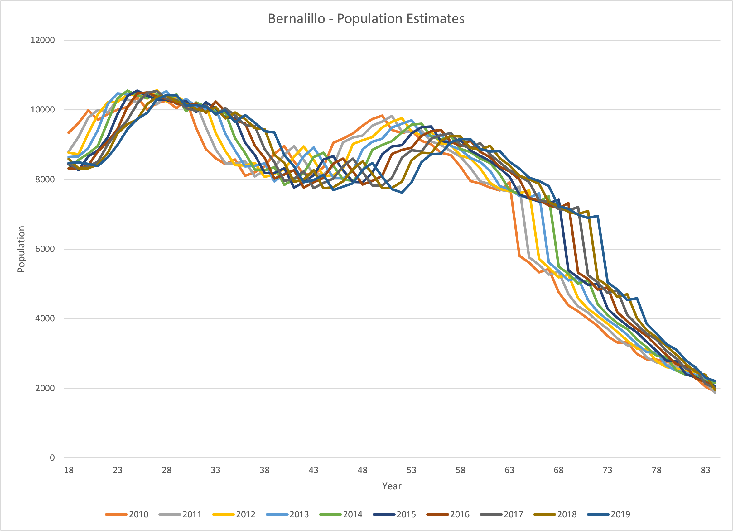
We can clearly see it follows a pattern.
It goes without saying that the Census bureau uses an algorithm to predict the population numbers for each age group.
If we “time shift” each curve so that they line up we get the following plot:
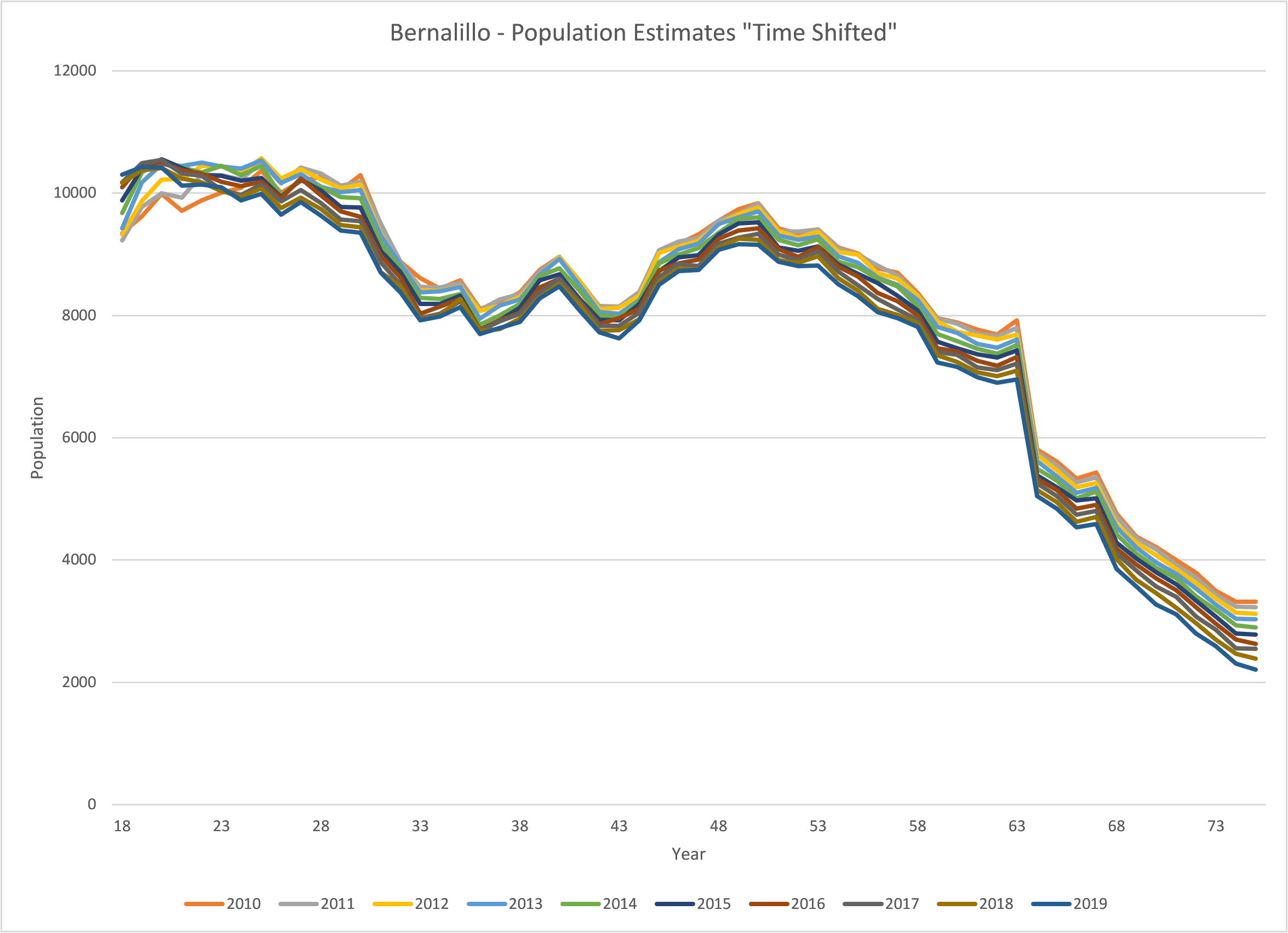
If we then calculate the ratio between consecutive years, we get the following plots:
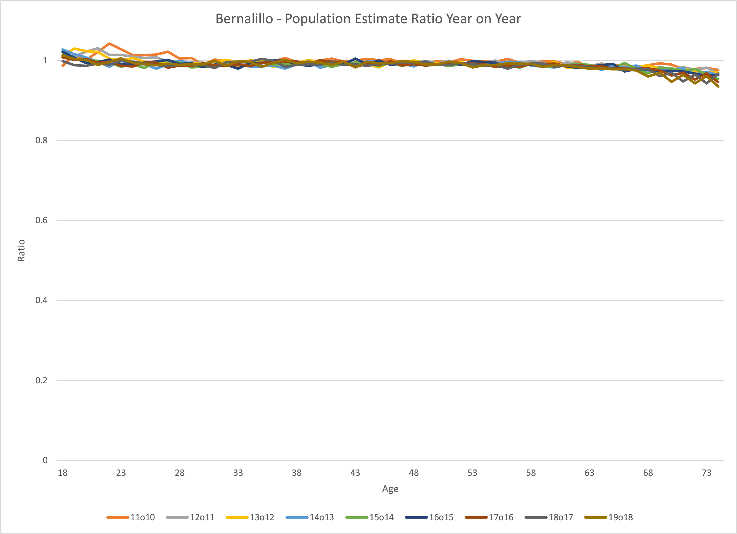
This is the “kicker”… Do you notice a clear “trend” between these ratio curves?
The answer is “probably”. The lines are “smooth”, but the trend is not “super” obvious. We can discern a slight trend downwards as the age increases. And therein lies the crux of the matter. When we analyze the ratio for data we know, as a matter of fact, uses an algorithm to estimate population trends and, we can’t easily discern an obvious trend; Yet, when we analyze the “v/r” ratio curves for several counties within a state and the trend is crystal clear; What does that tell us about the algorithm that is being used to produce votes from the registration numbers?
Ha! that was a trick question :-)…
The point is, the trend line is so clear that the only explanation is that an algorithm was used to determine the number of votes for each age based on the registration numbers!
(You might need to stop here to ponder what you have just seen and read.)
Once, you have fully recovered from the magnitude of the implications of this fact, (yes, we know, it might take a while…), the remainder of the article only gets better…
The population estimate data was found on the National Cancer Institute website and comes with the following warning: (Please carefully read the highlighted sections)
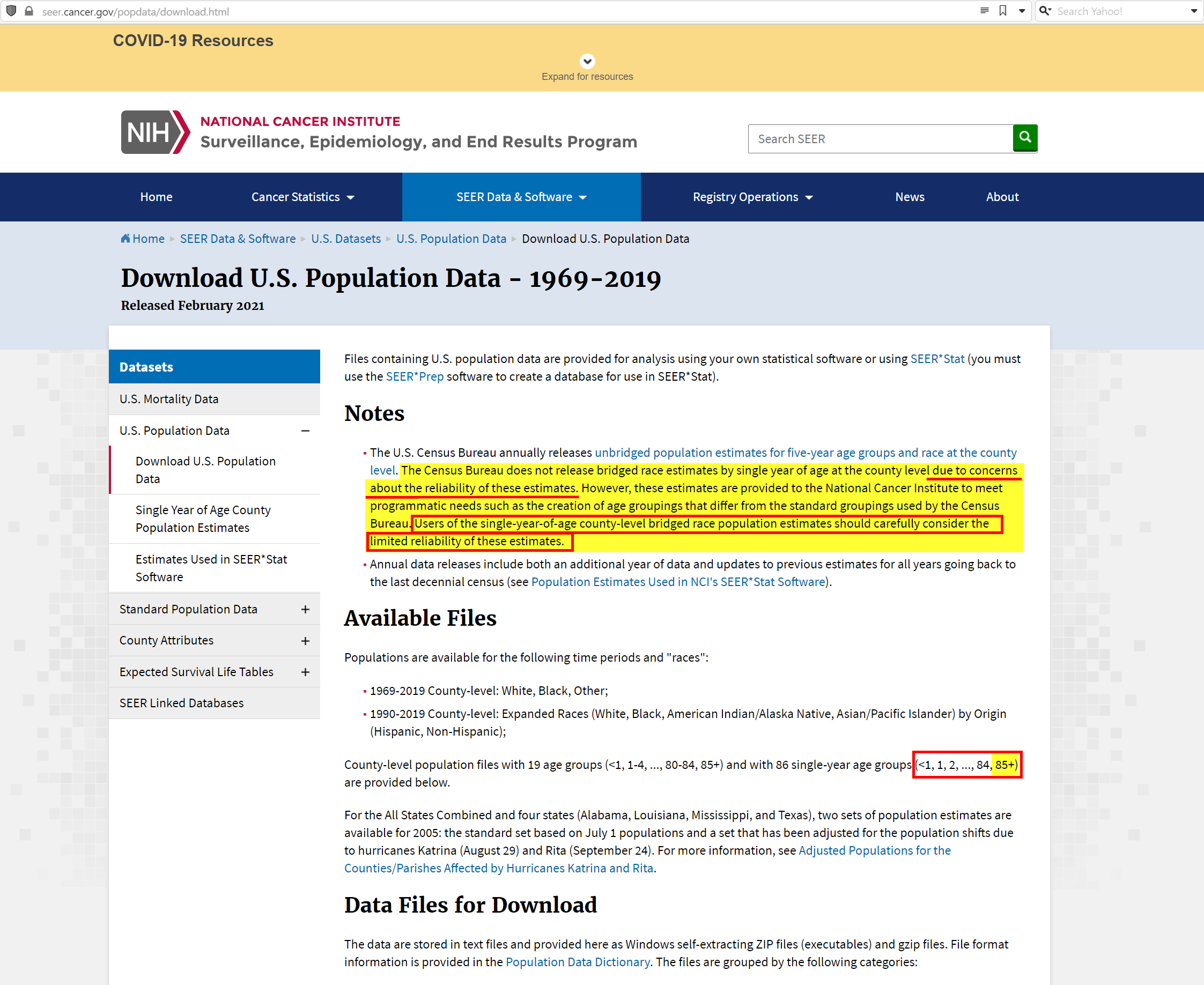
It clearly states that the population estimates have “limited reliability” and only go up to 84 years. (They include an 85+ age group that captures all the population above 85 years of age into a single data point.)
This makes a lot of sense, because the only section of the plots that actually looked “normal” was the section that was after the 85 year mark!
Let’s clearly illustrate this by plotting the v/r ratio curves for most of the NM counties:
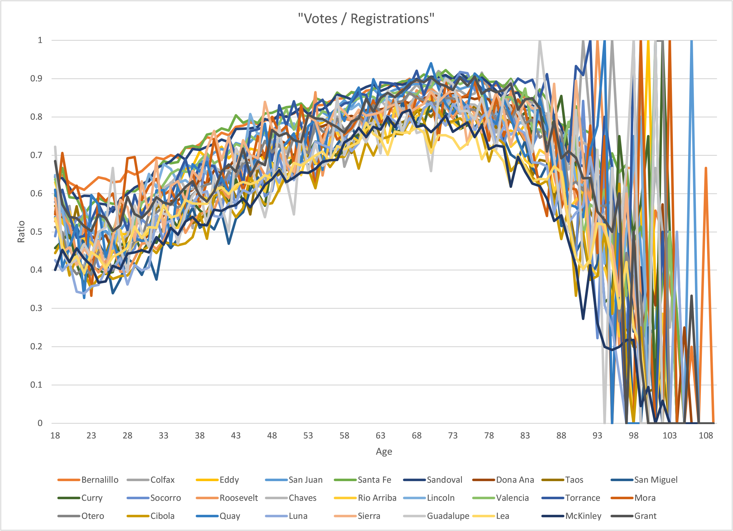
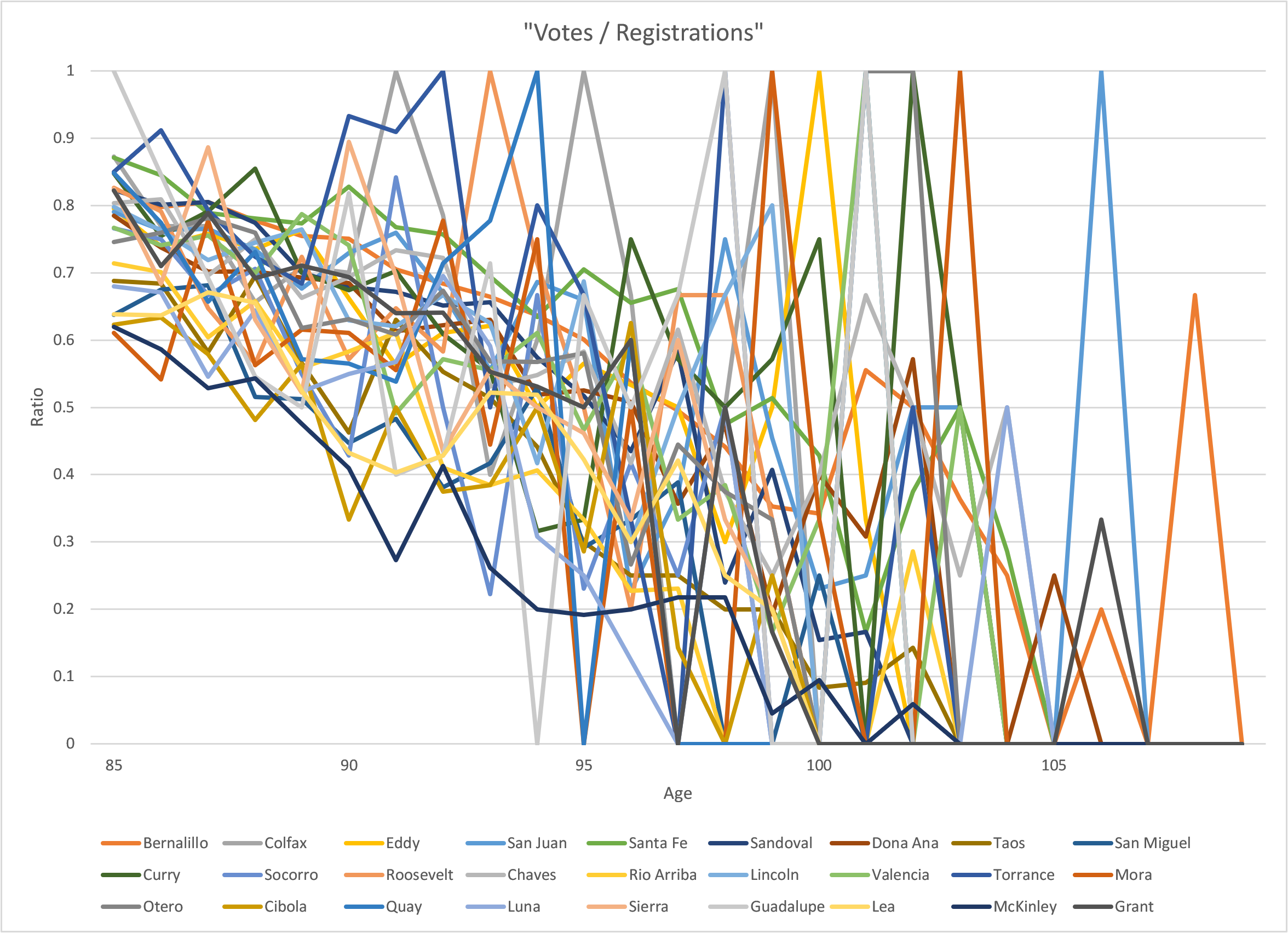
You can clearly see that the section between 85 and 109 is really messy. That is normal. That is precisely what we would expect to see if the data was normal and hadn’t been manipulated.
Just in case you want a clearer picture of what “normal” looks like, please see the image below that only contains the v/r ratios between the ages of 85 to 109 years:
With this new found knowledge, let’s now concentrate on the age range between 18 and 85, and try and figure out how “the algorithm” was designed to work.
Here are the v/r ratios between the ages of 18 and 85. Notice the clearly delineated “band”. This “band” contains a lot of information that we will dive into next. (Please take the time to appreciate the difference between the plots in the image below and the plots in the image above. This is exactly the reason why “smooth” ratio curves are a dead giveaway!):
Band Analysis
The shape of the band is very uniform, which indicates all counties follow a similar pattern.
We have already established that this pattern is unnatural and points to an algorithm being used in the background to achieve “pre-defined” outcomes.
This raises a whole raft of new questions concerning how “the algorithm” is designed to work.
When performing any type of data analysis it is good to start at the extremes.
We isolated the counties that are at the top of the band and the ones that are the bottom.
This is part of a “categorization” exercise to identify parameters these counties might have in common, and typically reveals meaningful correlations.
Here are the curve ratios for the counties at each extreme:
!!Image:band extremes!!
Observations
The characteristic of the counties at the top of the band is simple. They are the most populated counties in NM.
However, the characteristics of the counties at the bottom of the band are not as obvious. Sure they are less populated but we tried identifying other meaningful characteristics that would help explain why they were grouped together.
!!TODO: describe some parameters we looked at.!!
Nothing stood out, until we got to analyzing Los Alamos county.
Here are the curve ratios including Los Alamos county:
!!image!!
As you can see, it is the only county that clearly protrudes out of the band for the younger age groups. The overall shape is still the same. All be it, “flatter”.
And that was the insight we needed … Rather than looking for parameters in county attributes, the key is in understanding the curve “progression”.
The shape and position within a band is a reflection of a progression of moving counties from the bottom to the top of the band. Los Alamos is the only county “ahead” of the other counties in its “progression”. If we look more closely at the other counties the progression becomes obvious: !!Image!! The problem with many NM counties is that their “votes / registrations” ratio is nearly maxed out for the older age group. So in order for them to have more room to achieve the outcomes they desire they need to start manipulating the younger age groups. This is obvious in “Los Alamos”.
Harding
We mentioned that a lot of counties have maxed out their “v/r” ratio in older age groups. It is the most obvious in Harding.
!!Show the table!!
The 70 year-olds really dropped the ball… All other age groups had 100% turnout.
Show the population plot. Some age groups have more votes and registrants than the estimated population.
!!Image!!
The point is… if they can’t count the votes in smaller counties correctly, how can we trust them to count larger counties correct?
Republican Voting Patterns
Here is another disturbing pattern we noticed in the Republican Counties:
Does it mean the Republican counties cheated?
No, it simply means the elections for all counties is pre-defined in advance.
Pre-defined outcomes
Form doing a complete analysis of all counties in NM it is abundantly obvious that the election results are pre-determined.
The question is. How do they do it?
This is where we need to define some new terms:
- Lost Votes:
- Ghost Voters:
- Ghost Registrants:
We are still trying to put all the pieces of the puzzle together, but the findings made by Liz Harris, Dr. Frank, Bobby Piton and Draza Smith, clearly suggest a sophisticated apparatus of systematically “cooking” the voter roll records.
To be clear each state might be slightly different, however there are some over-arching similarities between all of them.
As Liz Harris discovered during her canvassing efforts in Maricopa county, over 33% of people canvassed, who were registered as having not voted had actually cast a vote.
Here are the scenarios:
- People vote but their vote does not count. They are registered has having not voted. (see Liz Harris’ report on Maricopa canvassing.)
- Ghost votes are assigned to real people on the voter roll, but they didn’t actually vote.
- Ghost votes are assigned to “fictional” voter registrants (i.e. “ghost” registrants. See Bobby Piton’s work)
- The whole election outcomes are pre-determined and the elections are run on “auto-pilot” (See Draza Smith’s work)
The “v/r” ratio is important. It reinforces the importance of the same ratios in the “Historical County Analysis with registrations” (i.e. the T/RR and T/DR ratios) in determining excess (or shortfall) votes for each party.
Talk about the “Battle of Largest Counties”. Largest counties all have higher “v/r” curves…
Show the gap analysis and the registration analysis
TODO: Look at population plot for Los Alamos. The registration should be very close to the population curve for older age groups so they had to start increasing the younger age groups.
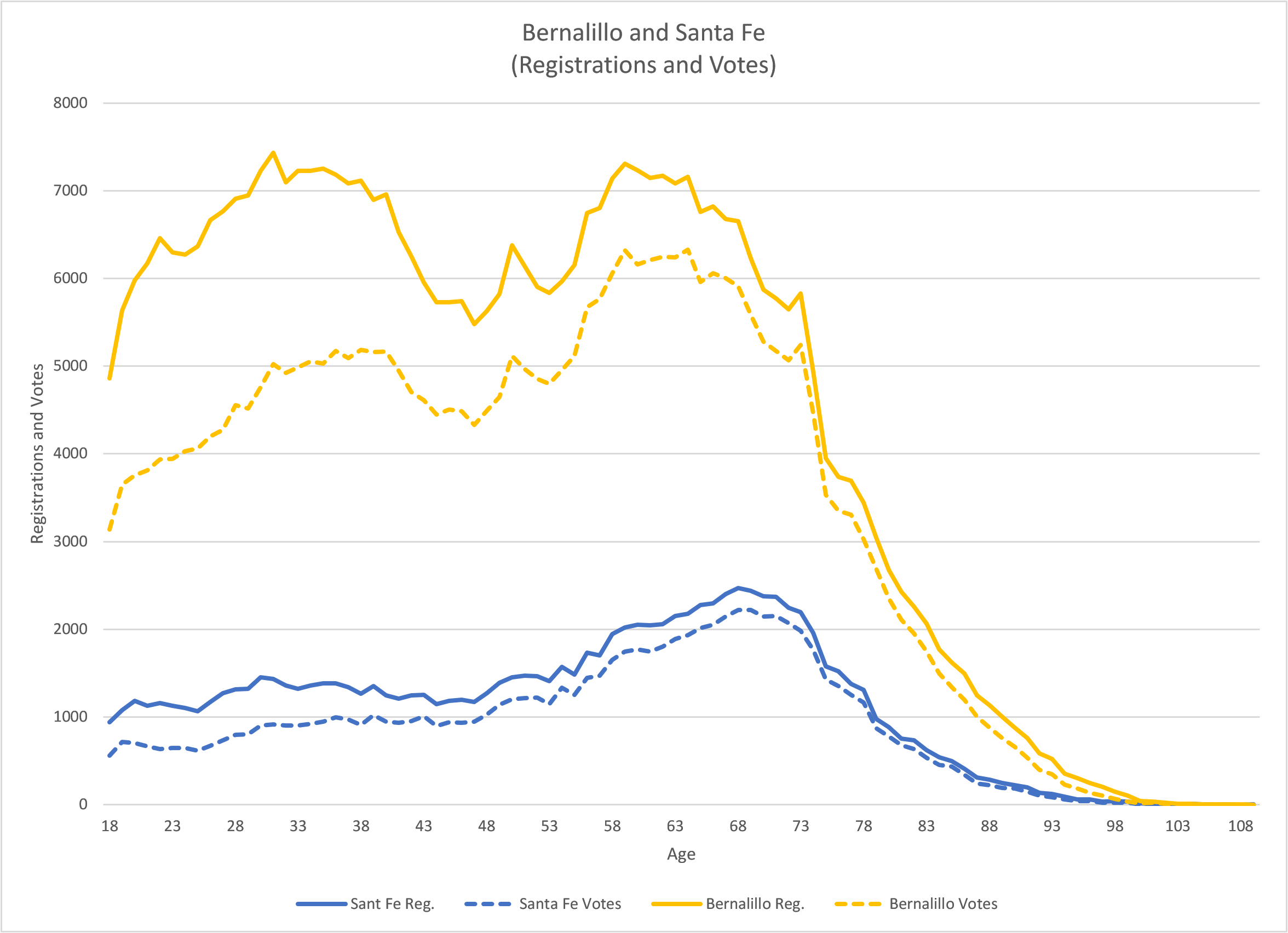
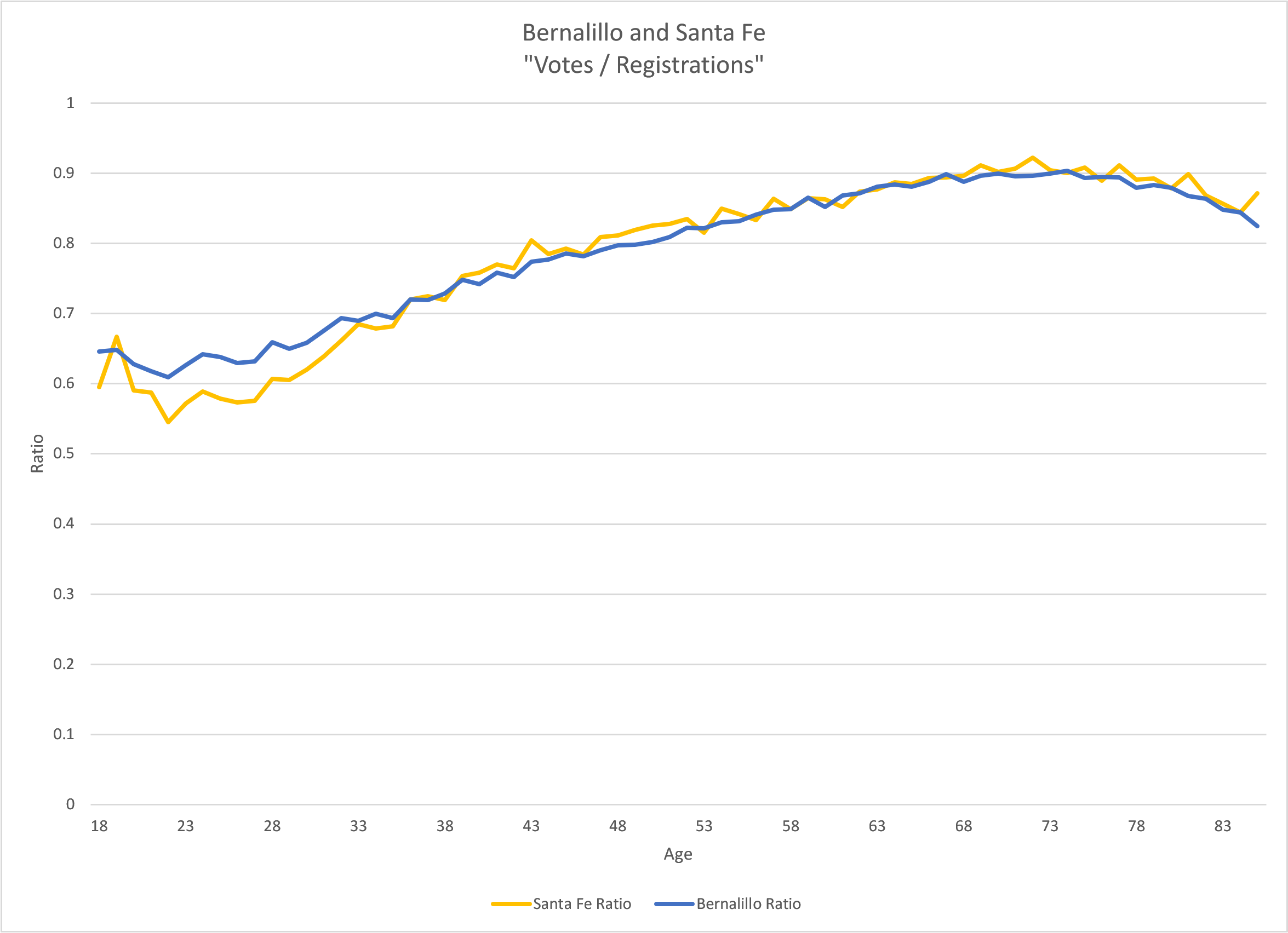
It is important to realize that all these counties have very different registration curve profiles, yet whenever you look at the “v/r” ratio, the curve ratios look exactly the same.
For example here are two counties (Bernalillo and Santa Fe) with very different registration and turnout profiles, yet their “v/r” ratio curves are nearly identical. We now know, this is no coincidence.
Important terms that people will need to familiarize themselves with:
- Lost votes:
- Phantom votes:
- Phantom registrants:
Visitor Comments
Did you find this article helpful? Did you dig in and review the data for your county or state? What did you find? Let us know in the comments below.