📃 This case study is based on the method we described in How to Predict Election Results Using Registration Data.
We’ll start with an overview of all counties in Maryland. Below is the “Historical County Range Analysis” table that we covered in Part 4, which will give us some direction for which counties to analyze first:
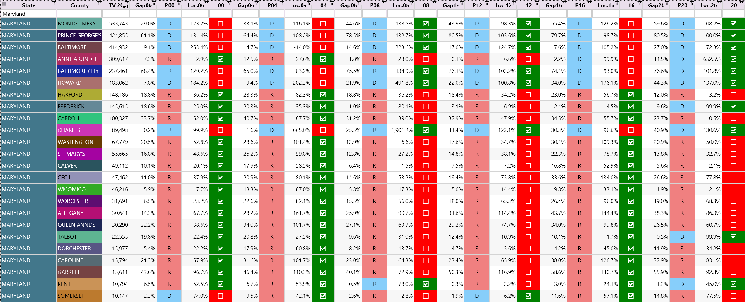
By scanning this table, there’s a few things we notice:
- 2 counties voted Democrat for the first time. They are Frederick and Talbot. (When we checked the historical records, they’ve voted Republican since at least 1988.)
- Kent also voted Democrat in 2020 for the first time since 2008.
- Anne Arundel has an (extremely) high Loc.20 value. It only turned Democrat in 2016.
- Baltimore, Howard, and Charles have very high Loc.20 values.
- Calvert and Wicomico have very low Loc.20 values.
This gives us a short-list of counties that deserve deeper inspection. Let’s start with Anne Arundel.
Anne Arundel County
In the state overview table above, Anne Arundel has an extremely high Loc.20 value. This is due to the Democrat winning margin increasing from 2.2% to 14.5% between the last two elections. This is a fairly large shift.
Back to the spreadsheet that we developed in our last article, we’ve populated the data for the county, over the six elections, and highlighted some of the numbers that stand out.
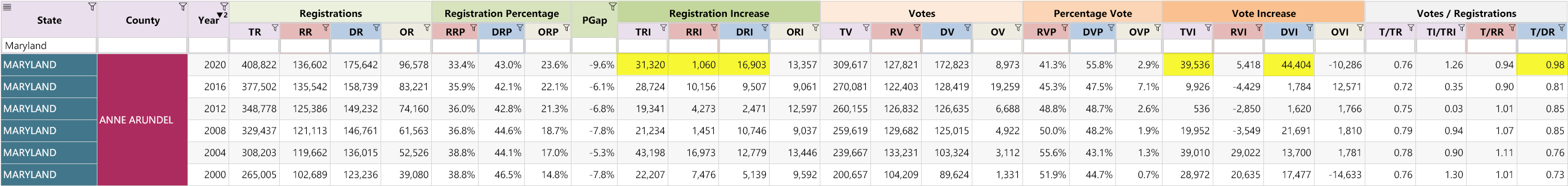
Observations:
- This county used to be Republican and switched to the Democrat party in 2016. The RVP has been steadily decreasing since 2004.
- Total vote in 2020: 309,617
- Columns to pay attention to are highlighted. They are from left to right: TRI, RRI, DRI, TVI, DRI and T/DR
- TRI: High registration increase of 31,320 in 2020
- DRI: Democrats increased their registration by a record 16,903 in 2020
- RRI: Republicans only increased their registration by 1,060
- TVI: Total Vote Increase of 39,536 which is similar to the TVI in 2004
- RVI: Republicans increased their votes for the first time since 2004
- DVI: Democrats increased their votes by 44,404, which is more than twice the previous record set in 2004
- T/RR (Republican turnout): Increased slightly to 0.94 but is well below the maximum set in 2004 (of 1.11). General trend is downwards.
- T/DR (Democrat turnout): Increased substantially to 0.98 and is a new record, exceeding the previous high of 0.85 established in 2012 by more than 0.14. ⚠️
(Yes, that is a lot. The more you study these numbers across many counties and states, the more you acquire an understanding of what is normal.)
Analysis:
The increase of 44,404 Democrat votes is suspicious enough and is the reason why the T/DR ratio is so high.
If we were to use a typical T/DR ratio of 0.85 from previous years, we can calculate an estimate of the excess votes.
| Estimate Democrat Votes (EDV): | DR * T/DR | = | 175,642 * 0.85 | = | 149,296 |
| Excess Democrat Votes: | DV – EDV | = | 172,823 – 149,296 | = | 23,527 |
This number is conservative as it does not account for the excessive new Democrat registrations in 2020 which may not all be 100% legitimate, as canvassing efforts in other states (see our canvassing page) have shown.
The real question is: The DVI in 2012 and 2016 was respectively 1,620 and 1,784. In 2020 it jumped to 44,404. What changed? Was Biden really that much more popular? Even more popular than Obama?
Baltimore City, Howard, and Charles have very similar patterns. In some of these cases the DVI was negative in 2016, only to see a surge in 2020.
Talbot County
This county voted Democrat for the first time in 2020.
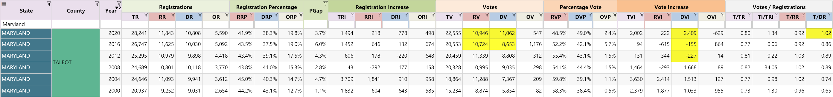
Observations:
- T/DR (Democrat turnout): Bucks the trend in 2020, with a huge surge to 1.02
- DVI: Democrat vote increase of 2,409, despite vote decreases (negative numbers) in the previous 2 elections
- DVI is more than 10 times bigger than RVI (quite incredible, especially for a county that has historically always voted Republican)
- Democrats won the county by 116 votes ⚠️
Analysis:
The T/DR is excessive. A more realistic number based on previous years would be 0.89 (and even that is generous).
| Estimate Democrat Votes (EDV): | DR * T/DR | = | 10,808 * 0.89 | = | 9,619 |
| Excess Democrat Votes: | DV – EDV | = | 11,062 – 9,619 | = | 1,443 |
If we accept this adjustment, Talbot (and Frederick) should have never turned blue in 2020.
We would start with a full forensic audit of the smaller counties to build momentum. Smaller counties are easier and faster to complete.
Calvert County
Here we have a Republican county with a very low Loc.20 value, meaning that it voted Republican, but the winning margin was relatively low compared to previous years.
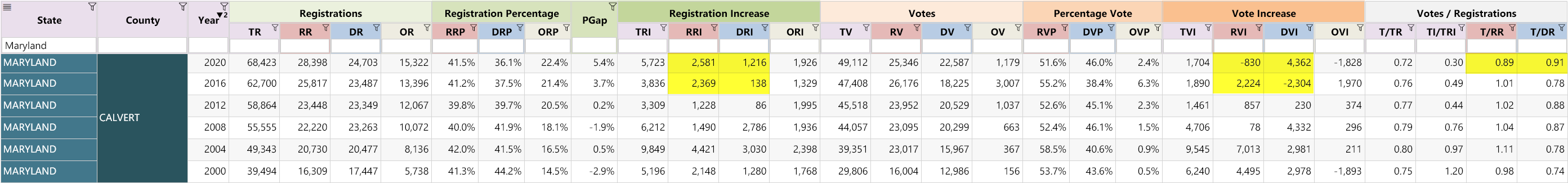
Observations:
- T/DR: Set a new record in 2020 at 0.91 ⚠️
- T/RR: Dropped significantly in 2020 to 0.89 (a 0.12 drop!) ⚠️
- DVI: Democrat vote increase of 4,362, despite a strong decrease (negative) in the 2016 election.
- RVI: Is negative for the first time ever! ⚠️ This is despite the Republican registrations increasing by 2,581 in 2020.
- It’s becoming more and more clear that the Democrats inflated their ballot counts in 2020. The real difference with Calvert is how aggressively the Republican votes were “trimmed”.
- It is also obvious that the T/RR was “trimmed” in Anne Arundel and Talbot in 2016 and 2020. Scroll back up and look at the drop. It was just more obvious in Calvert because they only started trimming the T/RR in 2020. (And yes the negative RVI is a dead give away.)
Analysis:
For Calvert, let’s perform an estimate for both the Republican and Democrat votes, based on the registration trends (we’ll assume again for now that the voter rolls are clean, although we’re seeing increasing evidence that they’re not).
- The T/DR (Democrat turnout rate) is high. A more realistic number would be 0.88 (We believe 0.76 is closer to reality, but we will be generous).
- The T/RR (Republican turnout rate) is too low. A realistic value, in keeping with the trend and previous elections, would be closer to 1.01.
| Estimated Democrat Votes (EDV): | DR * T/DR | = | 24,703 * 0.88 | = | 21,739 |
| Excess Democrat Votes: | DV - EDV | = | 22,587 - 21,739 | = | 848 |
| Estimated Republican Votes (ERV): | RR * T/RR | = | 28,398 * 1.01 | = | 28,682 |
| Shortfall Republican Votes: | ERV - RV | = | 28,682 - 25,346 | = | 3,336 |
| Total estimated discrepancy: | 4,184 |
This may not seem like a lot, but relatively speaking 4,184 represents 8.5% of all the total votes for Calvert County in 2020.
For further similar case studies, see: Arizona and Florida
Other Articles In This Series
| Overview | Diving deeper into the unusual trends and statistics discovered in the 2020 election. |
| Part 1 | A look at the surprising failure of the bellwether counties in 2020, and what that tells us about the Presidential election outcome. |
| Part 2 | The data shows the Democrats are winning less and less counties at each election, but are winning more and more of the largest counties. How is this possible? |
| Part 3 | Voter turnout rates shot up dramatically in many states in 2020. We look at the voting rates since 2000 to find out which states set a new record. |
| Part 4 | Learn how to "normalize" a county's winning margin to identify abnormalities. What does this reveal about the 2020 election? |
| Part 5 | Learn how to use the party registration numbers for each county to predict the election results for a state and assess the likely validity of the results. This is a guide on the method Seth Keshel uses for his predictions and county heat maps, allowing you to dig into the trends of your own county and uncover anomalies. |
| Part 6 | We build on some of the previous techniques to scan 3,111 American counties, identifying those whose shift in vote totals moves unexpectedly against the shift in party registrations. |
| Part 7 | We compare the Democrat vote totals with previous elections which reveal some very large increases in unlikely places. |
| Part 8 | We compare key parameters in the 2020 results against the previous five elections using the z-score, and find hundreds of counties breaking statistical norms. |
| Part 9 | Interesting statistical findings on how the Presidential race results compared to the other races in the same election. |
| Part 10 |
Voter Roll Analysis
Coming soon.
|
| Part 11 |
The Art of the Steal
Coming soon.
|
Follow us on Telegram to be notified when we release the remaining articles.
Visitor Comments
Have any thoughts or feedback on the data presented above? Let us know in the comments below.