📃 This case study is based on the method we described in How to Predict Election Results Using Registration Data.
Brevard County, Florida
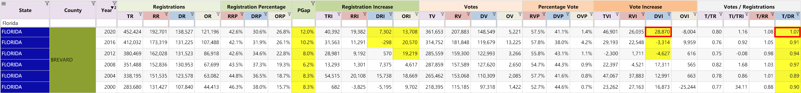
Brevard is a fairly large Republican county with 361,653 total votes in 2020.
Observations:
- PGap (the margin of Republican registrations over Democrats) has been consistently increasing since 2008, which should translate into a larger lead in Republican votes; but strangely, it doesn’t.
- T/DR (Democrat turnout rate): Makes a large jump from 0.91 to set a new record in 2020 at 1.07.
- DVI: We see a Democrat vote increase of 28,870 in 2020, despite previous elections being negative. ⚠️
Analysis:
If we were to use a more realistic T/DR turnout ratio of 0.89 (which is in line with the historical trend), we can estimate the Democrat excess votes.
| Estimate Democrat Votes (EDV): | DR * T/DR | = | 138,527 * 0.89 | = | 123,289 |
| Excess Democrat Votes: | DV - EDV | = | 148,549 - 123,289 | = | 24,960 |
Again, as we noted above, this number is conservative as it does not account for the unusual and excessive new Democrat and “Other” registrations in 2020.
🧐 We have seen a troubling trend across many counties where the increase in “Other” registrants (ORI column) seem to heavily favor the Democrat party. Are the voter rolls being padded or “stuffed” with fake unaffiliated voters which can be used to legitimize fraudulent Democrat votes?
Only with thorough audits and canvassing will we obtain conclusive answers.
For further similar case studies, see: Arizona and Maryland
Other Articles In This Series
| Overview | Diving deeper into the unusual trends and statistics discovered in the 2020 election. |
| Part 1 | A look at the surprising failure of the bellwether counties in 2020, and what that tells us about the Presidential election outcome. |
| Part 2 | The data shows the Democrats are winning less and less counties at each election, but are winning more and more of the largest counties. How is this possible? |
| Part 3 | Voter turnout rates shot up dramatically in many states in 2020. We look at the voting rates since 2000 to find out which states set a new record. |
| Part 4 | Learn how to "normalize" a county's winning margin to identify abnormalities. What does this reveal about the 2020 election? |
| Part 5 | Learn how to use the party registration numbers for each county to predict the election results for a state and assess the likely validity of the results. This is a guide on the method Seth Keshel uses for his predictions and county heat maps, allowing you to dig into the trends of your own county and uncover anomalies. |
| Part 6 | We build on some of the previous techniques to scan 3,111 American counties, identifying those whose shift in vote totals moves unexpectedly against the shift in party registrations. |
| Part 7 | We compare the Democrat vote totals with previous elections which reveal some very large increases in unlikely places. |
| Part 8 | We compare key parameters in the 2020 results against the previous five elections using the z-score, and find hundreds of counties breaking statistical norms. |
| Part 9 | Interesting statistical findings on how the Presidential race results compared to the other races in the same election. |
| Part 10 |
Voter Roll Analysis
Coming soon.
|
| Part 11 |
The Art of the Steal
Coming soon.
|
Follow us on Telegram to be notified when we release the remaining articles.
Visitor Comments
Have any thoughts or feedback on the data presented above? Let us know in the comments below.