📃 This article is Part 6 in a series on Identifying Electoral Fraud Using Trend Analysis.
We recommend reading these preceding articles in order to understand the context and terms used:
In this article we will analyse every county for which we have registration data, to see if the voting and registration trends align.
We’ll group counties into categories based on whether they trended “normally” or “abnormally”, and incorporate this into the “winning ranges” table we developed in Part 4.
Finding Counties With Unusual Trends
In Part 5 we gathered the party registration numbers for most counties in the US, as well as the votes cast for each party over the last 5 elections. We can now use this data to find out if the voting trends align with the registration trends.
Depending on the results we can group the counties into 4 different categories (or buckets):
| Y-D (Yes-Democrat) | Voter registration increase favors the Democrat party, and so does the vote increase. “Yes” means the trends align. |
| N-D (No-Democrat) | Voter registration increase favors the Democrat party, but the vote increase does not. “No” means the trends do not align. |
| Y-R (Yes-Republican) | Voter registration increase favors the Republican party, and so does the vote increase. “Yes” means the trends align. |
| N-R (No-Republican) | Voter registration increase favor the Republican party, but the vote increase does not. “No” means the trends do not align. |
We’ll call this categorization the “Registration and Voting Trend”, or “RVT” for short.
Categorization Example
Let’s look at the data from Pennsylvania as an example. Here are the most populated counties in Pennsylvania, with their corresponding RVT categories for 2020 and 2016, shown in the last two columns:
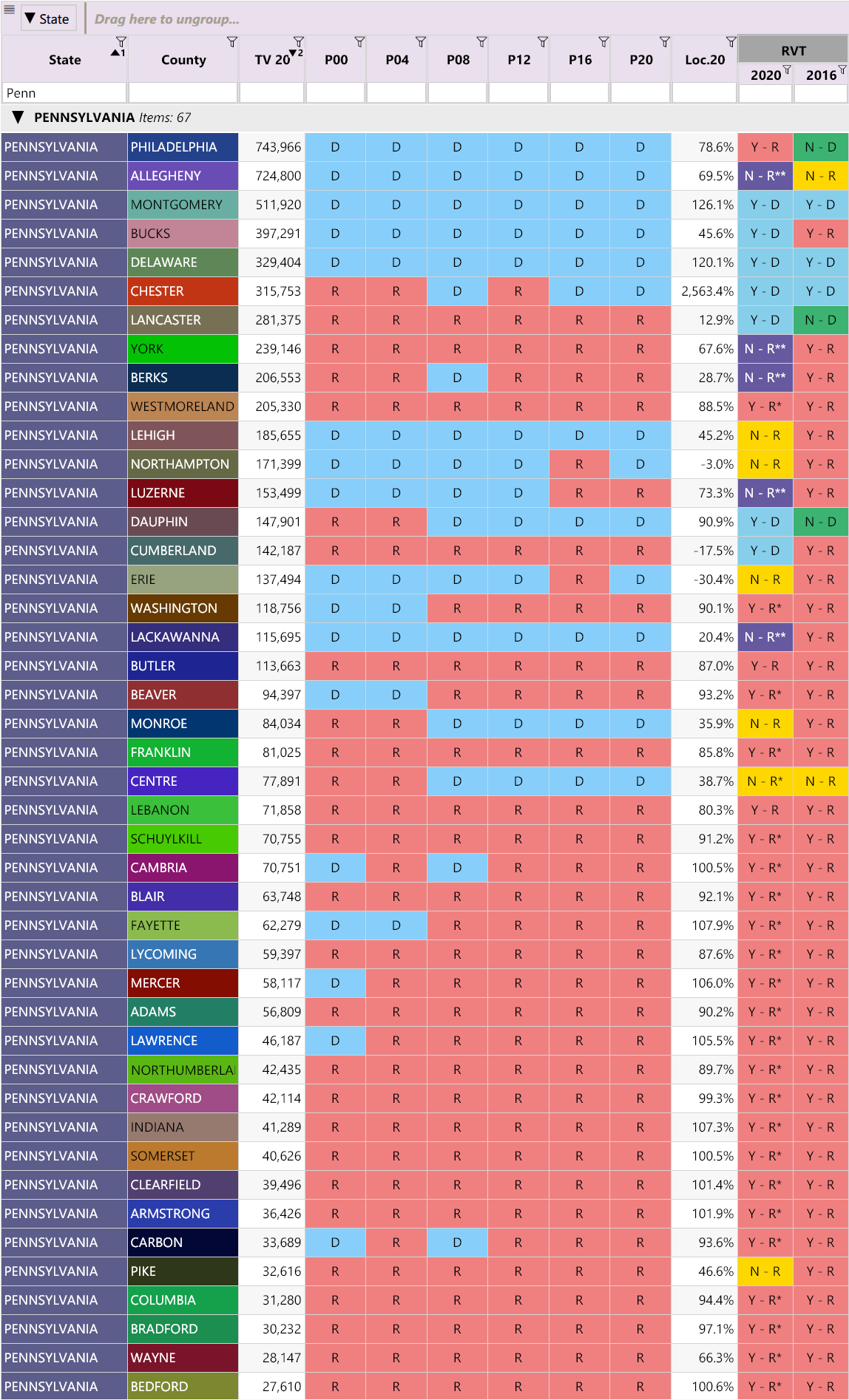
To show an example of how we arrived at this categorization, take a look at the historical results for Philadelphia and Allegheny counties:
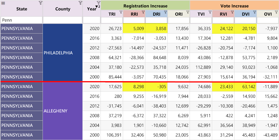
It shows that in Philadelphia in 2020, the increase in Republican registrations (RRI) is greater than the increase in Democrat registrations (DRI), and the increase in Republican votes (RVI) is greater than the increase in Democrat votes (DVI). This puts it in the RVT category of “Y-R”. (This might come as surprise to some people. Philadelphia has a lot of issues, but is nowhere near as bad as other PA counties, such as Allegheny.)
For Allegheny County, the RRI in 2020 is greater than the DRI, yet the RVI is lower than the DVI, so the RVT is “N-R”. In other words the registration increase favored the Republican party, but the vote increase favored the Democrat party. As the numbers show, the difference is significant and highly suspicious (especially since the DRI was negative and yet the DVI was a very large positive number, nearly 15 times larger than the 2008 DVI value achieved by Obama!).

💡 TIP:
For any given county:
-
If the DRI is negative, yet the DVI is positive, we add a star “*” next to the category.
-
If The DRI is negative, and the RRI is positive, yet the DVI is greater than the RVI, we add two stars “**” next to the category.
The stars are meant to emphasize that a county is highly suspicious and requires further investigations.
The more stars a county has, the more suspicious it is.
Keep an eye out for the trend bucking counties with a “N-R” category, with possibly one or two stars. (i.e. having a “N-R” category is already very suspicious. Having a star just makes it much worse.)
Observations:
Many “N-R” counties also have uncharacteristically low Loc.20 values. This is important, because these are two independent analyses that have corroborating results. In other words, it reinforces the validity of the “Winning-ranges” analysis and the importance of the Loc.20 value.
Which States Have The Most Abnormal Trends?
Now let’s categorize all counties across the US where we have access to party registration information. We can now filter the categories to show just the counties that bucked the trend — that is, counties with a RVT of “N-R” or “N-D”.
View all trend-bucking counties, by state
You might like to refer to the link above as we summarize the findings below.
There are several states that look very suspicious.
They are easy to identify because they have many counties with a “Y-R” category in 2016 but a “N-R” category in 2020. In other words, these are the states that had a shift towards higher numbers of Republican registrations and votes in 2016, but in 2020, despite a larger increase in Republican registrations, somehow ended up with more Democrat votes (!?).
These states are:
- Colorado (With lots of double stars!)
- Connecticut
- Delaware
- Florida
- Kentucky (With lots of double stars!)
- Louisiana (With lots of double stars!)
- Maine
- Maryland
- Massachusetts
- Nebraska
- Nevada
- New Hampshire
- New Mexico (With lots of double stars!)
- North Carolina (With lots of double stars!)
- Oklahoma (With lots of double stars!)
- Pennsylvania (With lots of double stars!)
- West Virginia (With lots of double stars!)
- Wyoming
Finally there are states that have a lot of “N-R” and “N-D” categories, which would suggest either one of two things (or both!):
- The voter rolls are completely inaccurate and need to be purged
- Either the registrations or the votes, or both, were tampered with during the 2020 election
These states are:
- California
- Idaho
- Iowa
- Massachusetts
- New Jersey
- New York
- North Carolina
- Oklahoma
- Oregon
- Rhode Island
- Utah
🤯 In 2020, out of 3,111 counties, 32 have a “N-D” category, and 199 have a “N-R” category.
This suggests there are over 6 times more counties which did not receive as many Republican votes as would be expected from the registration data, and they all happen to be in the most populated counties for their respective states. Coincidence? (Why are the smaller counties much better behaved than the largest ones?)
This can be clearly seen in the first image above for Pennsylvania. All the smaller counties have a “Y-R” value in 2016 and 2020, however the larger counties have more “N-R” values in 2020.
Conclusion
With so many counties bucking trends and setting new turnout records, combined with the reports of poor security and election mishandling, the results do look suspect. Statistics such as these can help identify which counties need a thorough inspection. We believe contacting voters directly (canvassing) combined with forensic audits (where necessary) is crucial to conclusively determining the validity of the election.
As you may have noticed, many states were missing from the RVT trend analysis. The reason is that many states don’t keep (or don’t share) registration records by party. When this is the case we can fall back on the Democrat Vote Increase (DVI) trends.
Our next article, Investigating the Large Democrat Vote Increases compares these Democrat votes with previous elections, revealing some very large increases in unlikely places.
Other Articles In This Series
| Overview | Diving deeper into the unusual trends and statistics discovered in the 2020 election. |
| Part 1 | A look at the surprising failure of the bellwether counties in 2020, and what that tells us about the Presidential election outcome. |
| Part 2 | The data shows the Democrats are winning less and less counties at each election, but are winning more and more of the largest counties. How is this possible? |
| Part 3 | Voter turnout rates shot up dramatically in many states in 2020. We look at the voting rates since 2000 to find out which states set a new record. |
| Part 4 | Learn how to "normalize" a county's winning margin to identify abnormalities. What does this reveal about the 2020 election? |
| Part 5 | Learn how to use the party registration numbers for each county to predict the election results for a state and assess the likely validity of the results. This is a guide on the method Seth Keshel uses for his predictions and county heat maps, allowing you to dig into the trends of your own county and uncover anomalies. |
| Part 6 |
The Counties Where Votes and Party Registrations Don't Align
We build on some of the previous techniques to scan 3,111 American counties, identifying those whose shift in vote totals moves unexpectedly against the shift in party registrations.
|
| Part 7 | We compare the Democrat vote totals with previous elections which reveal some very large increases in unlikely places. |
| Part 8 | We compare key parameters in the 2020 results against the previous five elections using the z-score, and find hundreds of counties breaking statistical norms. |
| Part 9 | Interesting statistical findings on how the Presidential race results compared to the other races in the same election. |
| Part 10 |
Voter Roll Analysis
Coming soon.
|
| Part 11 |
The Art of the Steal
Coming soon.
|
Follow us on Telegram to be notified when we release the remaining articles.
Visitor Comments
Did you find this article helpful? Did you dig in and review the data for your county or state? What did you find? Let us know in the comments below.