📃 This article is part of a series on Identifying Electoral Fraud Using Trend Analysis.
The data shows the Democrats are winning less and less counties at each election, but are winning more and more of the largest counties. How is this possible?
In the previous article we looked at The Fall of the Bellwether Counties in order to find counties with strong “predictive” qualities that overwhelmingly voted for the Democrat party in 2020. We did not find any. In fact we found the exact opposite!
In this article, we look at the historical statistical trends for the “winning” counties.
A “winning” county is simply a county that voted for the same party that ended up winning the General Election.
Understanding these trends will shed light on what we saw happen with the bellwether counties, and is key to unravelling the “Art of the Steal”.
Number of Winning Counties
There are officially 3,141 counties in the USA.
During our analysis (of all counties, across all elections since 1988), we noticed some counties were not consistent across all elections. In order to keep the analysis consistent from election to election, we had to remove 30 counties. (All the counties in Alaska and other smaller counties that have been combined or “merged” over the years. Their omission is negligible.)
This leaves us with a total of 3,111 consistent counties to analyze.
Let’s look at the number of counties that voted for the winning party at every election since 1988:
Do you notice any trends in this chart?
Let’s make it clearer.
Republican Counties Won
Democrat Counties Won
Can you see any trends?
Republican always win the Presidency with over 2,000 counties, and the trend is on a slightly upward trajectory, while Democrats are winning less and less counties. In fact there was a dramatic drop in winning counties after Clinton won over 1,500 counties in 1996. The trend is on a steep downwards trajectory.
💡 Trump won 2,574 counties in 2020, more than Bush in 2004, and 4.8 times more than Biden won, and yet still lost the election.
Somehow, Biden — who broke the “popular vote” record with over 80 million votes — only won (approx.) 537 counties, which is the smallest number of counties won by any President in the last 32 years (or about 17%!)
Because of the Electoral College, the number of counties won, doesn’t affect the end result — a candidate must win the entire state — but it does reveal an interesting issue.
The only way for Biden to win the election with so few counties, is for him to win the most populated counties. And it’s pretty clear that’s where they focused their efforts.
Average Winning Votes Per Winning County
Here’s another chart that shows the average number of winning votes each President received per winning county:
Let’s make it clearer.
Republican Votes Per County Won
Democrat Votes Per County Won
Do you see a trend? (Note that the scales are different: The Republican max value is about 16,000 whereas the Democrat max value is nearly 110,000).
The Democrats saw a huge increase in 2008 and another huge increase in 2020. Biden managed to increase the average winning votes per winning county by 44,837 votes over Obama’s 2012 number.
Let’s make it even clearer by grouping the parties together:
It helps put things in perspective…
The Boom in Total Votes
Now let’s look at another interesting trend. Here are the total votes cast, across all parties, at every election since 2000:
Look at that massive jump in 2020! Somehow, during COVID-19 lockdowns, voter turnout supposedly broke all records (or did the mail in ballots break all the records 😉). It begs the question: were all those votes legitimate?
We’re asking that ourselves. Is it possible that Democrat cities with the largest populations were the focus of fraudulent votes?
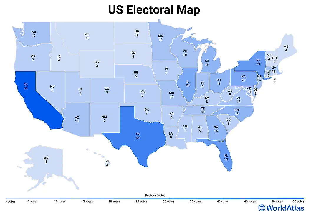
Anecdotally, should this trend continue, the Democrats are only going to need to win the 12 most populated counties, in the 12 most populated states, to collect enough electoral college votes to win the Presidency. (And they’ll probably aim to win the “popular vote” too, to make it all look more “credible”. 😉)
If you look at how many college votes are available in each state, you can quickly see why Texas (and Florida) are so appealing to them:
What Happened to Obama’s Counties?
Obama won 873 counties in 2008. If we look at these 873 counties in 2020, Trump won 42% of them, and Biden just 58% (or 506 counties).
Which Counties Did Biden Flip?
The Democrat party won 32 new counties in 2020. These are counties that voted for the Democrat party for the first time in 2020 (in a very long time).
Conveniently these counties are amongst the most populated in their respective states.
The Republican Percentage Vote (RPV) has slowly but surely been eroded over the last several elections. Is it part of a master plan?
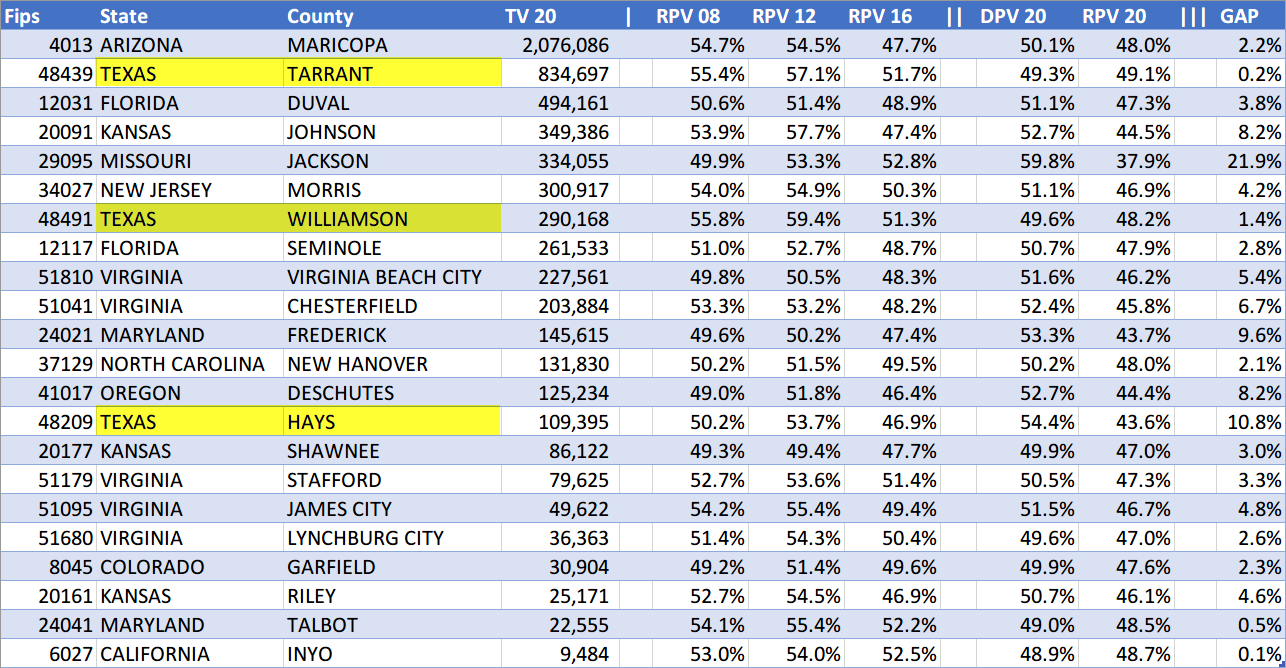
Some of these counties show a huge swing towards the Democrat party, which break all historical trends. For example:
-
Jackson, Missouri voted Republican in the previous several elections, but it ended up Democrat by a huge 21.9% margin in 2020
-
Hays, Texas similarly ended up with a 10.8% Democrat margin
These are very large percentage shifts to happen over just one election cycle!
A small gap number does not make it any less suspicious. Maricopa County had a relatively small gap of 2.2%, yet showed enough issues to warrant a full forensic audit. It makes us wonder what went on behind the scenes to swing those counties by such large margins?!
In the table above, you can see 3 Texas counties highlighted. Did we mention Texas appears to be part of a master plan to have it turn blue over the next few election cycles? (Can you spot the other 2 Florida counties?)
And what happened in Virginia? Would you believe us if we told you Trump should have won Virginia by a landslide? (If you keep reading, you will learn the necessary techniques to figure it out on your own.)
Winning County Detailed Statistics
Skip ahead to the conclusion if tables full of numbers baffle you. 😉
In this section we compare several key statistics for all counties (Table 1) versus the most populated counties (those with at least 200K votes in 2020, Table 2):

(Click image to enlarge)
| Column | Description |
|---|---|
| WP | Winning Party |
| TC | Total Counties |
| RC | Republican (won) Counties |
| DG | Democrat (won) Counties |
| CWP | Counties Won Percentage |
| WCV | Winning County Votes (i.e. across all winning counties) |
| AWVWC | Average Winning Votes per Winning County |
| ATVWC | Average Total Votes per Winning County |
| APWVWC | Average Percentage Winning Votes per Winning County |
| AWCVI_D | Average Winning County Vote Increase - Democrats |
| AWCVI_R | Average Winning County Vote Increase - Republicans |
| AVC | Average Votes per County |
| TV | Total Votes (Country wide) |
| RV | Total Republican Votes |
| DV | Total Democrat Votes |
| RV-DV | Total Republican Votes minus Total Democrat Votes |
| TRI | Total Republican Increase (in votes) |
| TRIR | Total Republican Increase (in votes) in Republican won counties |
| TRID | Total Republican Increase (in votes) in Democrat won counties |
| TDI | Total Democrat Increase (in votes) |
| TDIR | Total Democrat Increase (in votes) in Republican won counties |
| TDID | Total Democrat Increase (in votes) in Democrat won counties |
Observations:
-
There were 184 counties with over 200K total votes
-
These 184 counties account for more than 50% of all votes across the whole country
-
Democrats only won 17% of all counties in 2020, but they won 80% of all counties that have more than 200K total votes (!)
-
Very telling: the Total Republican Vote Increase in Democrat won counties (TRID) in Table 2 was huge in 2020 (despite being negative in 2008, 2012 and 2016) (!!). This could explain the large overall vote increase at the 2020 election. In order to keep these counties blue, the TDID had to be greater than the TRID. (We will let you surmise how that was achieved.)
1988 to 2020 Results

Observations:
-
In Table 1, Clinton won 49% of all counties in 1992 and 1996. Since then, the percentage of counties won by a Democrat President has decreased dramatically. Why haven’t recent Democrat Presidents been able to win as many counties as him?
- In Table 2, Democrats keep winning a larger percentage share of the most populated counties at each election.
- Clinton started with 59% in 1992. Biden is at 80% in 2020. Where will it stop?
-
In Table 1, large positive numbers in TRID indicate a Republican win. (Trump won in 2016 because of the large positive number in TRIR, which is even larger in 2020)
-
In Table 1, look at the TDID in 2020. 10.7 million is much larger than any previous number in this column (suspect? 🤔)
- TDI value in 2020 is unprecedented and excessive
Conclusion
The trend is obvious. Democrats are winning less and less counties, but they are winning more and more of the most populated counties.
When you take the time for these trends to “sink in”, everything else starts to make a lot more sense.
Other Articles In This Series
| Overview | Diving deeper into the unusual trends and statistics discovered in the 2020 election. |
| Part 1 | A look at the surprising failure of the bellwether counties in 2020, and what that tells us about the Presidential election outcome. |
| Part 2 |
The Battle for the Largest Counties
The data shows the Democrats are winning less and less counties at each election, but are winning more and more of the largest counties. How is this possible?
|
| Part 3 | Voter turnout rates shot up dramatically in many states in 2020. We look at the voting rates since 2000 to find out which states set a new record. |
| Part 4 | Learn how to "normalize" a county's winning margin to identify abnormalities. What does this reveal about the 2020 election? |
| Part 5 | Learn how to use the party registration numbers for each county to predict the election results for a state and assess the likely validity of the results. This is a guide on the method Seth Keshel uses for his predictions and county heat maps, allowing you to dig into the trends of your own county and uncover anomalies. |
| Part 6 | We build on some of the previous techniques to scan 3,111 American counties, identifying those whose shift in vote totals moves unexpectedly against the shift in party registrations. |
| Part 7 | We compare the Democrat vote totals with previous elections which reveal some very large increases in unlikely places. |
| Part 8 | We compare key parameters in the 2020 results against the previous five elections using the z-score, and find hundreds of counties breaking statistical norms. |
| Part 9 | Interesting statistical findings on how the Presidential race results compared to the other races in the same election. |
| Part 10 |
Voter Roll Analysis
Coming soon.
|
| Part 11 |
The Art of the Steal
Coming soon.
|
Follow us on Telegram to be notified when we release the remaining articles.