See also the main article on Nebraska, for documented election integrity issues and further reports.
The following presentation shows Dr. Doug Frank’s analysis of the 2020 election data in Nebraska. For an overview of Dr. Frank’s approach and findings, see the main page on Dr. Frank’s Election Analysis.
Using 2010 US Census data and updated 2019 American Community Survey data from the Census Bureau, Dr. Frank is able to predict not only the voter turnout by age, but voter registration by age. When Frank’s prediction is compared to the actual voter turnout and voter registration by age, it correlates to an unusually high level of accuracy.
Pay particular attention to:
-
Counties where the percent of population registered to vote is higher than 95%. This may simply be poor administration in not removing old voters from the rolls, or it may provide some indication of counties where “phantom” voters were been added to the rolls for the purpose of submitting fraudulent votes. These deserve deeper investigation.
-
How accurately Dr. Frank was able to predict the voting turnout based on the census data and applying his algorithm (as shown by the “R=” correlation coefficient and visualized on the charts in red and pale blue lines). Very high numbers above 0.95 may indicate some form of algorithmic manipulation of votes.
Watch on Rumble, July 30, 2021. A similar presentation in NE was recorded here.
The following video shows the charts for each county (slides only, no audio):
Other points to note:
-
Sometimes the ballot count numbers and voter registration numbers used by Dr. Frank differ from other official sources. This appears to be because in these comparisons, Dr. Frank takes the number of voters from the state’s voter rolls (or “voter history file”) rather than the official number of votes. In a number of states these numbers do not reconcile accurately, an indicator of poorly administered voter rolls. See Dr. Frank’s mention of this issue, and take this into account with your comparisons.
-
Many states also demonstrate poor clean-up of their voter rolls, where voters that have died or moved interstate are left on the rolls for extended periods of time. This might explain some of the high numbers of registered voters vs residents, including instances where this is over 100%. Although it appears fraudulent at first glance, some of this might simply be poor administration. It definitely deserves a deeper look, however.
Registrants and Voters by County
The below charts compare the official election report (dated Dec 4th, 2020) with the voter rolls on Dec 4th for each county. In a properly run election there should be zero differences between the two records. But as you can see many hundreds of anomalies exist.
The red bars show the number of ballots that were tallied, but not assigned to voters in the rolls. The black bars show the number of registrants added or removed from each county’s rolls.
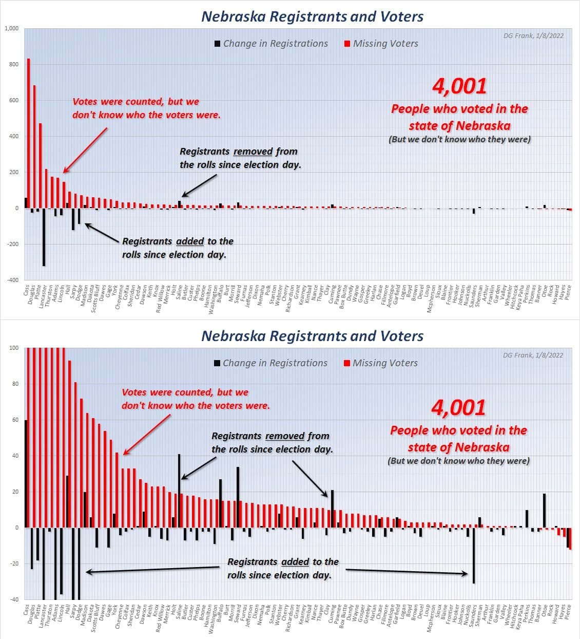
This second chart shows the same data but amplified by a factor of ten to see the differences more clearly.
The top ten worst counties on this chart were:
- Cass
- Douglas
- Platte
- Lancaster
- Thurston
- Adams
- Lincoln
- Hall
- Sarpy
- Dodge
Source: Dr Doug Frank, https://t.me/FollowTheData/1614
Voter Registration & Turnout Compared to Other States
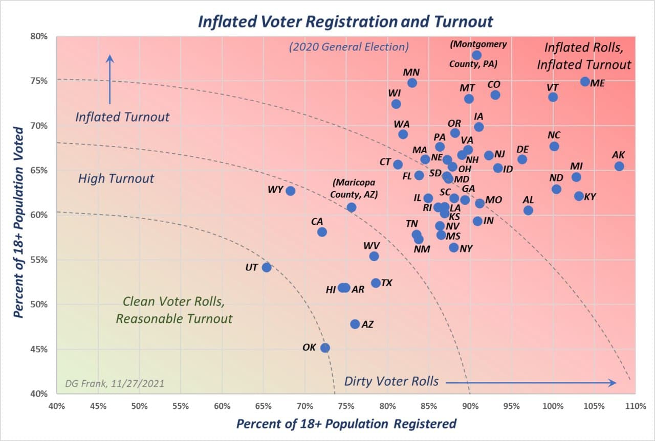
Source: Telegram Post, Nov 28, 2021